THIS IS NOT INVESTMENT ADVICE. ACTING BASED ON THIS POST MAY, AND IN ALL PROBABILITY WILL, CAUSE MONETARY LOSS.
Quantile regression is now established as an important econometric tool. Unlike mean regression (OLS), the target is not the mean given x but some quantile given x. You can use it to find stocks that present good upside potential. You may think it has to do with the beta of a stock, but the beta is OLS-related, and is symmetric. High-beta stock rewards with an upside swing if the market spikes but symmetrically, you can suffer a large draw-down when the market drops. This is not an upside potential.
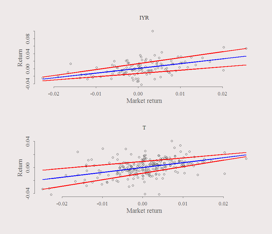
The possible usage of Quantile Regression is best understood using the following figures:

What is plotted is the returns of a stock over the return of the SPY. The blue line is the OLS fitted values and the red lines are the quantile (80% and 20%) fitted values.
In the upper panel you can see that when the market moves up (high positive value on the X-axis) there is large dispersion of the Y-axis. Large relative to the dispersion that occurs for this symbol when the market moves down. In the bottom panel, the situation is reversed. When the market moves up, you ‘pretty much know’ what will happen with the stock, but when the market is in negative territory, there is less certainty about the return of the stock. Other factors accounted for, you want to have upper-panel stocks in your portfolio. They can surprise you when the market is up but at the same time provide relative certainty on the way down.
The following code scans the tickers you feed it and find the best ratio, i.e., high dispersion on the way up, but low dispersion on the way down:
|
1 2 3 4 5 6 7 8 9 10 11 12 13 14 15 16 17 18 19 20 21 22 23 24 25 26 27 28 29 30 31 32 33 34 35 36 37 38 39 40 41 42 43 44 45 46 47 48 49 50 51 52 53 54 55 56 57 58 59 60 61 62 63 64 65 |
tickers <- readLines("tick.txt") getinterdaydat = function(sym, k){ end<- format(Sys.Date(),"%Y-%m-%d") start<-format(Sys.Date() - k,"%Y-%m-%d") dat0 = (getSymbols(sym[1], src="yahoo", from=start, to=end, auto.assign = F, warnings = FALSE,symbol.lookup = F)) n <<- NROW(dat0) ; l <<- length(sym) prlev = matrix(nrow = n, ncol = l) dat = array(dim = c(n,NCOL(dat0),l)) ret = matrix(nrow = n, ncol = l) for (i in 1:l){ dat0 = (getSymbols(sym[i], src="yahoo", from=start, to=end, auto.assign = F,warnings = FALSE,symbol.lookup = F)) nn <<- NROW(dat0) dat[1:nn,,i] = dat0 prlev[1:nn,i] = as.numeric(dat[1:nn,4,i]+dat[1:nn,1,i]+dat[1:nn,2,i]+dat[1:nn,3,i])/4 # "average" daily price level ret[2:nn,i] = dat[2:nn,4,i]/dat[1:(nn-1),4,i] - 1 } list(ret = ret, p = prlev) } # Ask most recent 365 days: dat <- getinterdaydat(sym = c(tickers,"SPY"),365) # Chop the sample in two ins <- n/2 # Ask the slopes for 20% and 80% # You can play around with this Tau = c(.2,.8) qslope <- matrix(ncol = (l-1), nrow = length(Tau)) for (j in 1:(l-1)){ for (i in 1:length(Tau)){ qslope[i,j] = rq(dat$ret[2:ins,j]~dat$ret[2:ins,l], tau = Tau[i])$coef[2] } } # Determine which symbols are useful: rat0 <- qslope[2,]/qslope[1,] rat <- rat0[rat0<2 & rat0>(-2)] # get rid of funny looking values dat$ret <- dat$ret[,rat0<2 & rat0>(-2)] l <- NCOL(dat$ret) ## plots lwd1 = 2 ; col1 = 2 par(mfrow = c(2,1)) plot(dat$ret[1:ins,which.max(rat)]~dat$ret[1:ins,l], ylab = "Return", xlab = "Market return" ) lines(rq(dat$ret[1:ins,which.max(rat)]~dat$ret[1:ins,l], tau = Tau[1])$fit~dat$ret[2:ins,l], lwd = lwd1, col = col1 ) lines(rq(dat$ret[1:ins,which.max(rat)]~dat$ret[1:ins,l], tau = Tau[2])$fit~dat$ret[2:ins,l], lwd = lwd1, col = col1 ) lines(lm(dat$ret[1:ins,which.max(rat)]~dat$ret[1:ins,l])$fit~dat$ret[2:ins,l], lwd = lwd1, col = 'blue' ) nam <- tickers[which.max(rat)] title(nam) plot(dat$ret[1:n,which.min(rat)]~dat$ret[1:n,l],ylab = "Return", xlab = "Market return" ) lines(rq(dat$ret[1:n,which.min(rat)]~dat$ret[1:n,l], tau = Tau[1])$fit~dat$ret[2:n,l], lwd = lwd1, col = col1 ) lines(rq(dat$ret[1:n,which.min(rat)]~dat$ret[1:n,l], tau = Tau[2])$fit~dat$ret[2:n,l], lwd = lwd1, col = col1 ) lines(lm(dat$ret[1:n,which.min(rat)]~dat$ret[1:n,l])$fit~dat$ret[2:n,l], lwd = lwd1, col = 'blue' ) nam <- tickers[which.min(rat)] title(nam) |
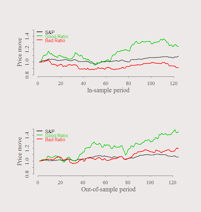
We used first half of the sample to choose which stocks we want to use. Say we short the stock with the worst ratio, and long the stock with the best ratio. The symbols are in the title of the previous figure, IYR (long) and T (short). Lets see what happens in the second half of the sample:
|
1 2 3 4 5 6 7 8 9 10 11 12 13 14 15 16 |
dat$p <- dat$p[,rat0<2 & rat0>(-2)] plot(dat$p[1:ins,l]/dat$p[1,l], ty = "l", ylim = c(.8,1.5), xlab = "In-sample period", ylab = "Price move", lwd = lwd1) lines(dat$p[1:ins,which.max(rat)]/dat$p[1,which.max(rat)], ty = "l", col = 3,lwd = lwd1) lines(dat$p[1:ins,which.min(rat)]/dat$p[1,which.min(rat)], ty = "l", col = 2,lwd = lwd1) legend('topleft', bty = "n", legend = c("S&P","Good Ratio","Bad Ratio"), col = c(1,3,2), lwd = lwd1, lty = 1, text.col = c(1,3,2)) plot(dat$p[ins:n,l]/dat$p[ins,l], ty = "l", ylim = c(.8,1.5), xlab = "Out-of-sample period", ylab = "Price move", lwd = lwd1) lines(dat$p[ins:n,which.max(rat)]/dat$p[ins,which.max(rat)], ty = "l", col = 3,lwd = lwd1) lines(dat$p[ins:n,which.min(rat)]/dat$p[ins,which.min(rat)], ty = "l", col = 2,lwd = lwd1) legend('topleft', bty = "n", legend = c("S&P","Good Ratio","Bad Ratio"), col = c(1,3,2), lwd = lwd1, lty = 1, text.col = c(1,3,2)) |

This exercise is illustrative only. No sharp ratios, accounting for other risk factors or comparing this strategy with alternatives. Just an idea.
Some further reading:
Quantile Regression (Econometric Society Monographs)


Interesting stuff! Have you looked at whether small caps / stocks from certain (tech?) sectors are overrepresented among the ‘good ratio’ stocks?
Did not, but in any case, first is to verify ‘potential’ actually stands for ‘potential’ and not other factors, which is slightly more involved.
Please can you repost the code. Thank you, great blog!
Thanks. Just click on the right arrow in the corner to view the code.