I am picking up on Rob Hyndman’s suggestion on dark themes for writing. I carried on with a bit of “internet-scientific” reading. Opinions on ‘dark vs white’ background themes, which is better for your eyes, are mixed. You are busy, so just the bottom line: do what works for you.
I noticed that it is also in my case that I prefer bright font over darkish background, even before I read his post, I had my tablet settings yellow-over-black theme. So after reading Rob’s post, and changing my editors accordingly, I got to thinking it is probably not the best idea bouncing from dark editors to white backgrounds almost everywhere else. Would be nice, and I think healthier for your eyes to have some uniformity. These are the a few steps I took in that direction.
- Windows:
- Browser:
- PDF:
You can go to: Control Panel\Appearance and Personalization\Personalization and change your windows theme. As I suspected, I was unhappy with the high contrast built-in. You can click on the “Get more themes online” link and choose one from there, or google online and install a dark theme from a third party.
If you use chrome, you can install Morpheon dark theme for chrome. I did not experimented with any other, just read the favorable reviews and am happy with that. I can imagine there are parallels for all other modern browsers.
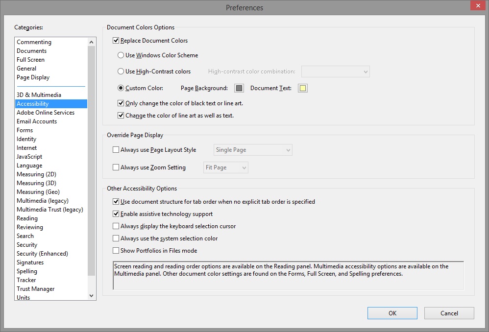
for me, that is the most useful of the three. Open a pdf –> edit –> Preferences –> accessibility. I tried to change to the default dark scheme they offer, that is no good. Most documents contain figures which simply vanish, as the lines are not treated as fonts (fonts adjust but figures become black on black). What you can do is:
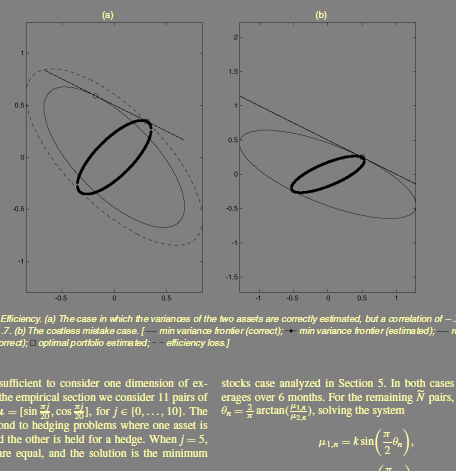
 which results in:
Will this prevent your glasses subscription a decade from now? who knows.


