Package Eplot on cran.
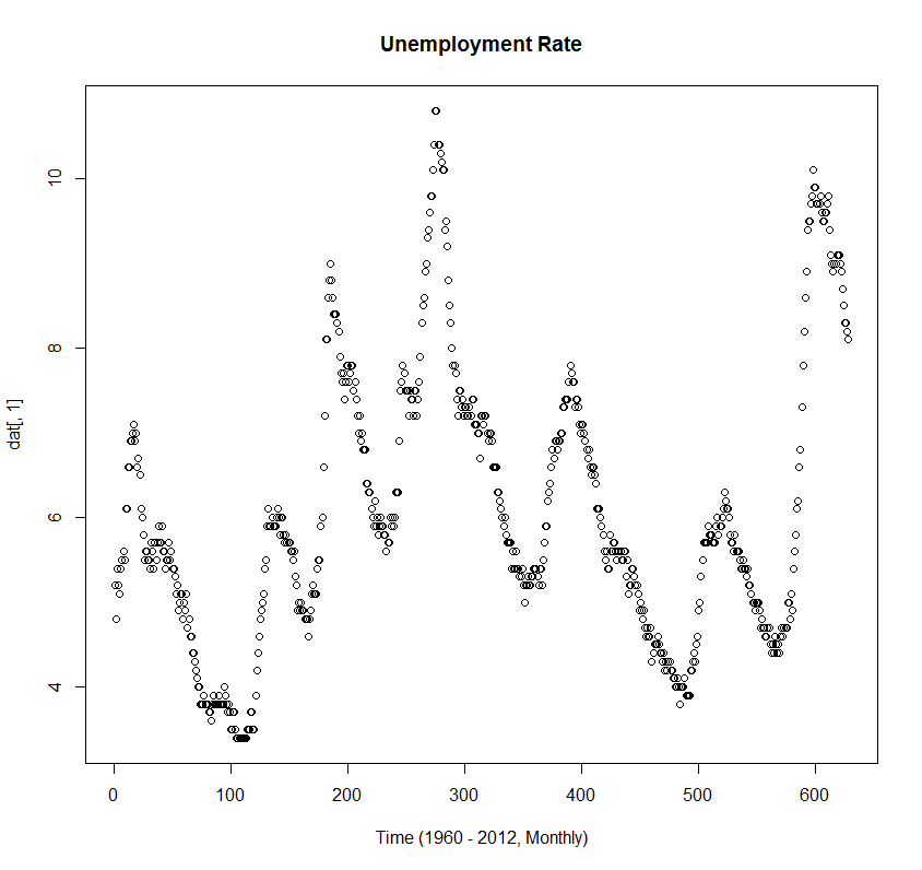
Easily convert your chart from this:
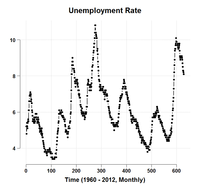
to this:
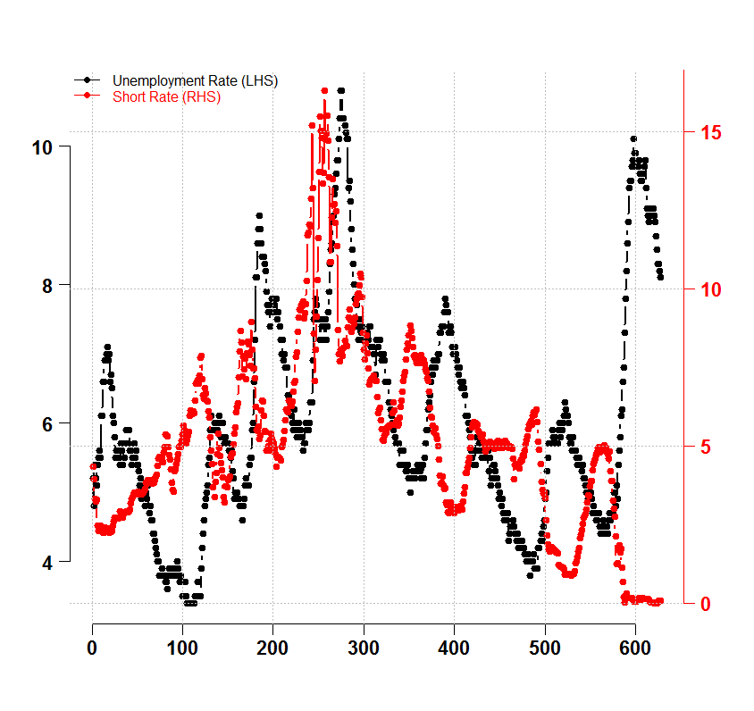
When you don’t have time to do Granger causality testing. You can do this:
library(Eplot) # I will be extending this packagage
dat = as.matrix(read.table(file = "https://dl.dropbox.com/u/9409065/UnemployementData.txt",header=T) )
head(dat)
plot(dat[,1], main = "Unemployment Rate", xlab = "Time (1960 - 2012, Monthly)")
plott(dat[,1], main = "Unemployment Rate", xlab = "Time (1960 - 2012, Monthly)",return.to.default=TRUE)
tsideplot(dat[,1],dat[,2],return.to.default=TRUE)
legend('topleft',c("Unemployment Rate (LHS)","Short Rate (RHS)"),col=1:2,pch=19,lty=1,bty="n",text.col=1:2)
# Comments welcome


