Numbers are useful (I think we can all agree on that..). If you own a smart phone, you can install this runmeter app. When you run, you can take the smartphone with you and activate this app to collect interesting numbers like distance, pace, fastest pace, heart rate*, calories etc. Now we can load the statistics collected over the past months into R and have a quantified look at the progress.
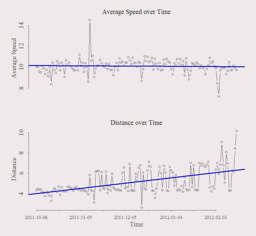
Each data point represents a specific run. The figure presents average speed over the sample period (upper panel) and the distance over the sample period (lower panel):

As you can see, I take it easy! with an average of about 6 minutes per kilometer. The regression line in the upper panel clearly states I am not becoming any faster. The regression line on the bottom panel however, shows that the distance ran increased over time which paints the upper panel result more favorably.
We had the Rotterdam Marathon few weeks back where I jogged 10K with some friends. So the last few data points the distance pushed upwards since I wasn’t sure I am able to finish the 10K without stopping. It was the first time I saw up-close people running the 42.5K, that was fascinating. To be honest, I am already tired after 5K so those people remind me the machines from the terminator movies.
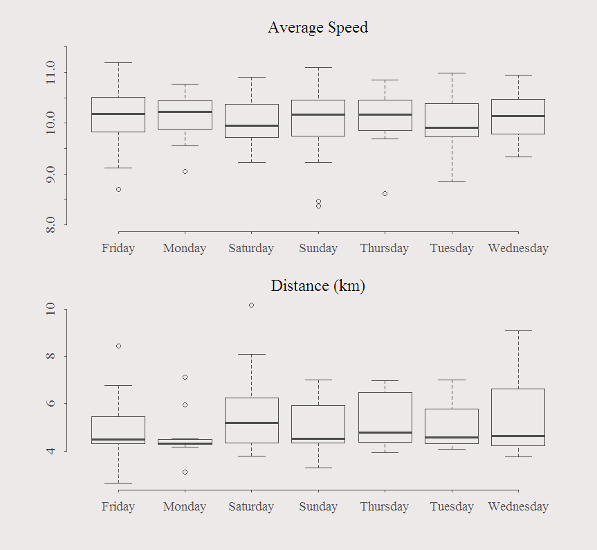
Few box-plots according to days of the week:
 Upper panel shows that I am a bit slower on Saturdays and Tuesdays and bottom panel shows that if I run on Monday it is almost always to, or from university which is about 4K from my place.
This is just a flat example. For more detailed analysis, you can add the time of day, elevation, temperature and other external variables you think might impact your running time. Does it help to drink redbull before the jog? add a redbull dummy.
* Extra device needed to record your heart rate.
|
1 2 3 4 5 6 7 8 9 10 11 12 13 14 15 16 17 18 19 20 21 22 |
t0 = read.table("jogging.txt", header = T, sep = "\t") summary(t0) ; dim(t0) ; names(t0) ; class(t0) ; head(t0) TT <- NROW(t0) date = as.Date(t0[,1],"%m/%d/%Y") ; head(date) days <- weekdays(date) par(mfrow = c(2,1)) h0 <- 9 h1 <- 1.4 plot(t0[,4], ty = "b", ylab = "Average Speed", xaxt = "n",cex.axis =h1, cex.main =h1, xlab = "", cex.lab = h1, main = "Average Speed over Time") abline(lm(t0[,4]~c(1:TT)), col = 4, lwd = 3) # Regression on a trend plot(t0[,3], ty = "b", main = "Distance over Time",ylab = "Distance", xaxt = "n", xlab = "Time",cex.axis =h1, cex.main =h1, cex.lab = h1) axis(1,at = round(seq(1,TT,TT/h0)), labels = as.character(date[seq(1,TT,TT/h0)]) ) abline(lm(t0[,3]~c(1:TT)), col = 4, lwd = 3) #Box-plot boxplot(t0[,4]~days, ylim = c(8,11.5), cex.axis =1.2, cex.main =1.5, main = "Average Speed") boxplot(t0[,3]~days, ylim = NULL, cex.axis =1.2,cex.main =1.5, main = "Distance (km)") |


Very entertaining post! The bar plots would be easier to read if they would be in chronological order.