Not sure why is that, but traditionally we consider 60% stocks and 40% bonds to be a good portfolio mix. One which strikes decent balance between risk and return. I don’t want to blubber here about the notion of risk. However, I do note that I feel uncomfortable interchanging risk with volatility as we most often do. I am not unhappy with volatility, I am unhappy with realized loss, that is decidedly not the same thing. Not to mention volatility does not have to be to the downside (though I just did).
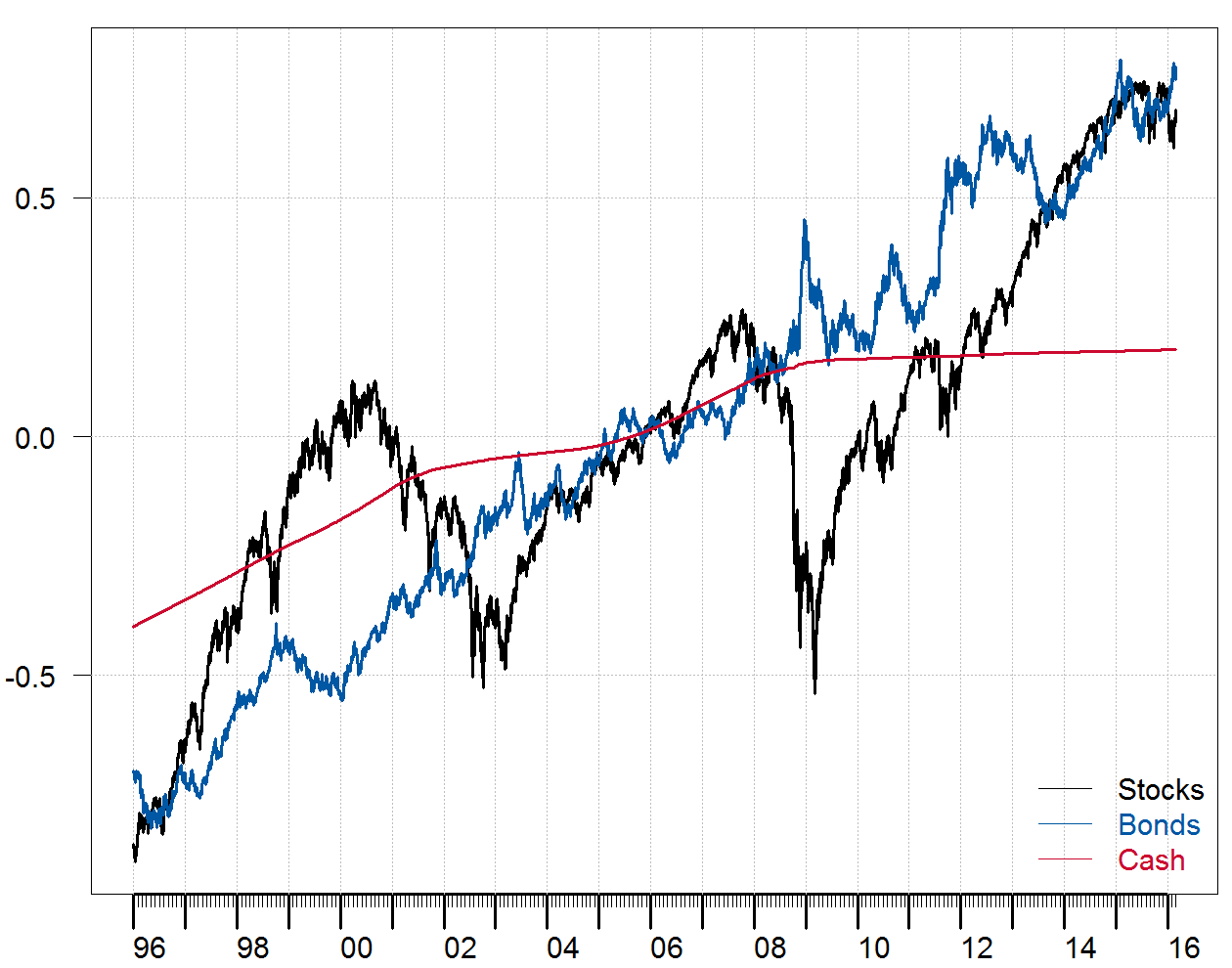
Let’s take a look at this 60/40 mix more closely. Data from Yahoo does not take into account dividends or reinvested coupons, so I use total return indexes (no public data available for this post). We use US stocks, US bonds and US cash. All dating back to 1996. The figure plots the centered (not scaled) log of the indexes:
The next figure plot the cumulative returns on those indexes:
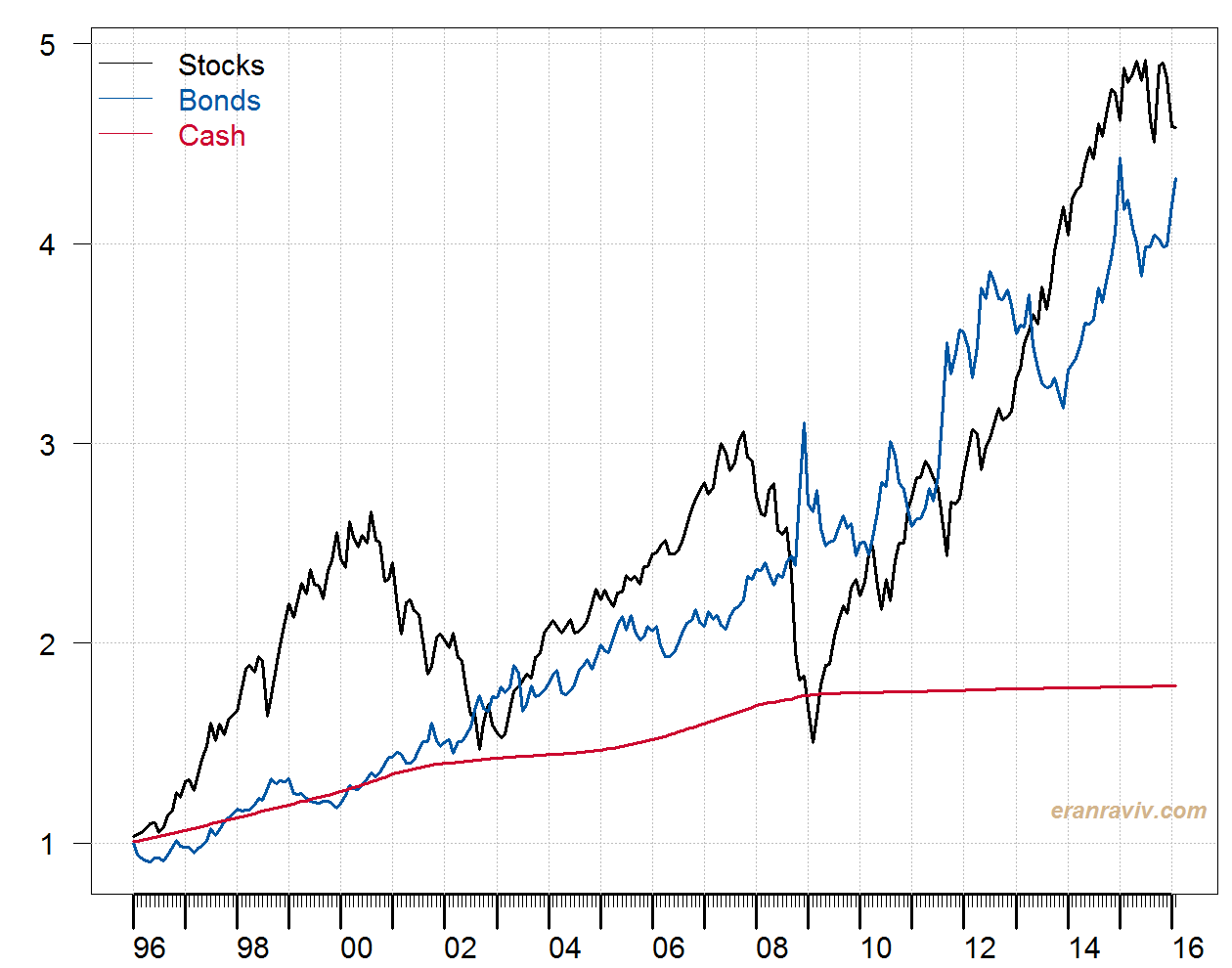
As expected, one dollar invested in stocks would yield more than the one dollar invested in bonds, for this point in time at least. But also, one dollar put away in stocks when I was 18 would yield me less than cash when I was 31, ain’t that something. People my age had time to wait for the rebound (true, those of us who didn’t enjoy margin calls). But my mom quickly neared her retirement back then. Volatility is much more of a risk for her than it is for me. Let’s have a look at the annualized volatility (%):
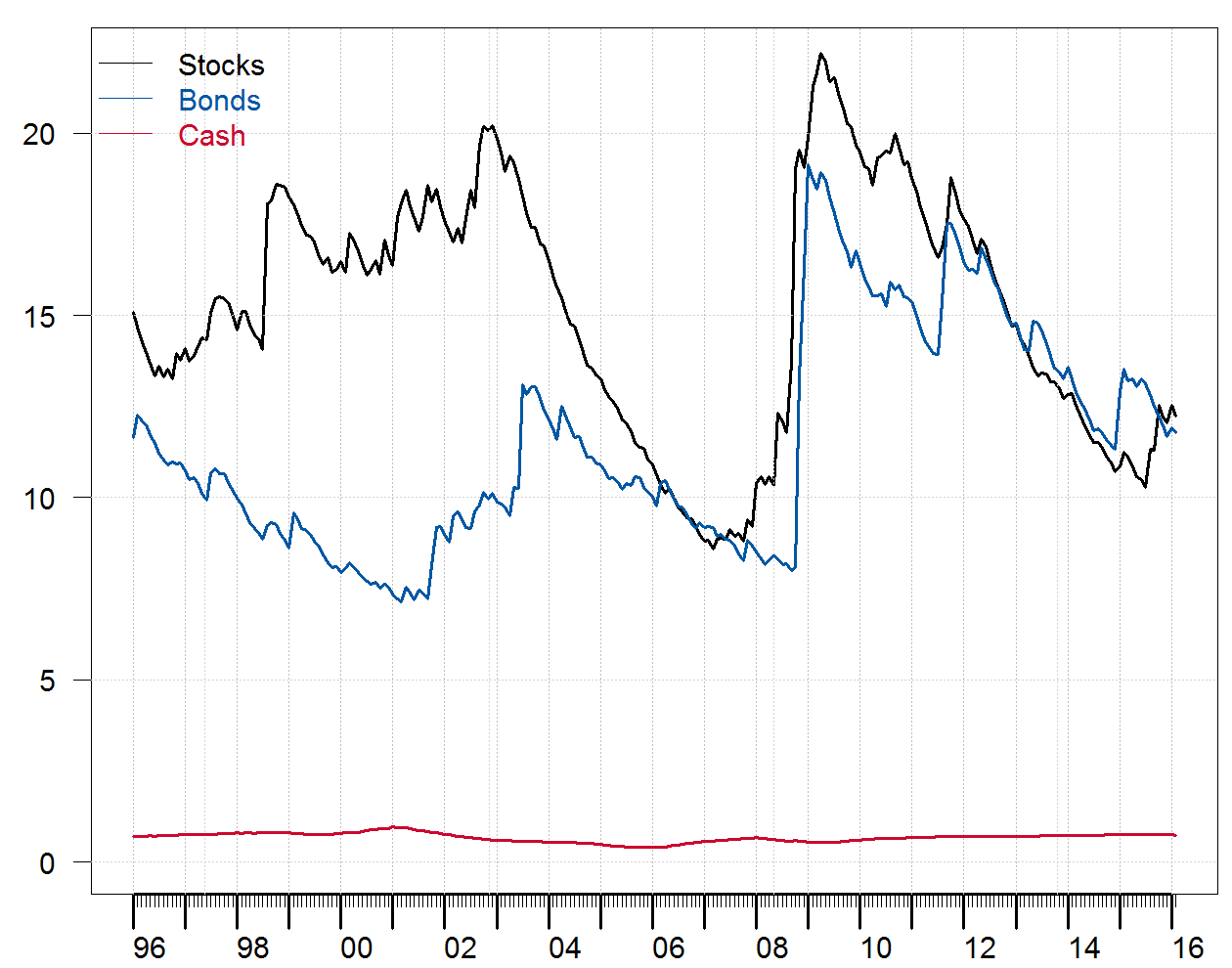
The volatility was estimated using an exponentially weighted model. Stocks have been more volatile before the crisis, but since then they present quite similar volatility to bonds. Mainly because the volatility of bonds is slightly higher.
What happens on a yearly basis?
I compute the mean monthly return and divide by the mean monthly standard deviation, per year.
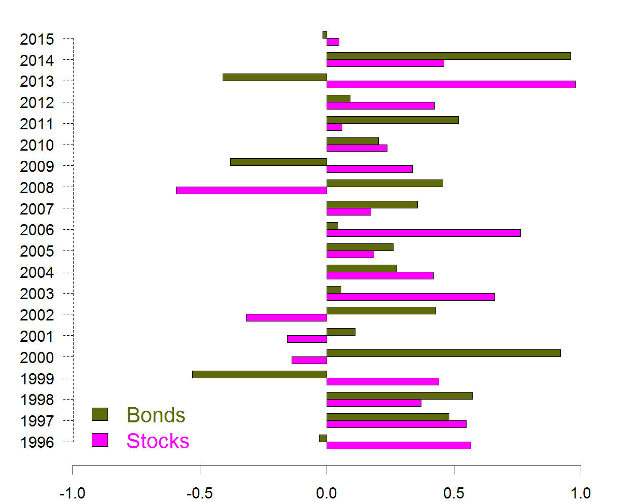
You see here why it is a good idea to have them both in your portfolio. There are often years in which the bars stand on opposite sides, meaning those eggs are not in the same basket.
From the second figure we already know how much we would get if we would be fully invested in stocks, or we would be fully invested in bonds. Let’s now compute how would the portfolio look like with different portions of bonds in it. See if the 60/40 actually makes sense based on this data. We compare the cumulative performance for different proportion of bonds in the portfolio, from no bonds at all, i.e. 0%, through 20%, 40%, 60%, 80% and fully invested in bonds: 100%.
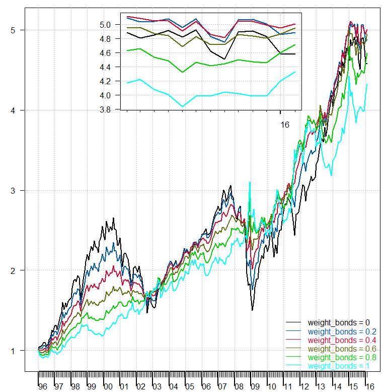
The small subplot is there to zoom in on the last few observation, not very clear from the figure without squinting. We see that indeed the 60/40 portfolio achieves the highest cumulative returns. Although they are not very different than that of the 80/20 or the 40/60 portfolio mix.
A final word of caution. Those charts are based on 20 years of US data, where at the start of the sample the US 10Y rates were around 7.5%, while today they are below 2%.
some code
weight_bonds <- c(0, .2,.4,.6,.8, 1)
l <- length(weight_bonds)
weight_stocks <- 1-weight_bonds
ret_port <- matrix(nrow= TT, ncol= l)
for (j in 1:l){
  for (i in 1:TT){
  ret_port[i,j] <- as.numeric(weight_bonds[j]* ret[i, "Bonds"] ) + as.numeric(weight_stocks[j]* ret[i, "Stocks"])
}}

cum_ret_port <- matrix(nrow= TT, ncol= l)
for(j in 1:l){
  for (i in 1:TT){
    cum_ret_port[i, j] <- cumsum(prod(1+ret_port[1:i, j]))
  }}


I totally agree with your post. If you look at 20% stocks/ 80% bonds and consider risk then one might reconsider whether stocks are that promising. Looking at Sharpe-Ratios of such portfolios and draw downs would be even more persuading. Furthermore as I recall this period was great for US stocks. If you look at European stocks (e.g. stoxx50 or broader, not just DAX) then the bonds would probably win the game, a 20/80 portfolio for sure.
Good post. This mix continues to perform, though its volatility being near historic lows is a tad worrisome. We use 60/40 to benchmark, because if you can’t beat the risk/reward on something this simple, there aren’t many reasons to allocate differently.
Good post – you correctly point out that bonds have been a one-way bet (more-or-less) over the duration of your study. In fact that trend started with Volcker in 1980 – a 36 year one-way bet!
If you have the data it would be informative to study 40 year (an investing lifetime?) rolling windows across 100 years, say.
Will we ever see real interest rates (i.e. bond prices set in a real market) in our lifetimes? Who knows.
Great post – could you please share the code used to generate the charts for performance / yearly Sharpe? thank you