First things first.
What do we mean by sparse estimation?
Sparse – thinly scattered or distributed; not thick or dense.
In our context, the term ‘sparse’ is installed in the intersection between machine-learning and statistics. Broadly speaking, it refers to a situation where a solution to a problem is partly something and partly nothing. Using a regression, you will get a full solution: a full vector of coefficients. Using LASSO regression you also get a vector of coefficients, but some or even most are exactly zero, so in that sense it is not full. If we have a vector of length 10, and only 2 entries are nonzero, we say that the vector is 2-sparse.
Sparsity property is upward trending in importance, quickly
This goes hand in hand with big data. Think about the matrix AMAZON has to handle, each row is a person, each column is a book. There are over 30 million titles sold on site. That is a BIG matrix right there. Your own row i is a vector with entry 1 where you bought the book in column j and 0 otherwise. Your own row-vector must be sparse (no offense meant). This is since there is no such person who read most books. Different people care about different things. The link between this amazing title and any statistical book is practically non-existent. I dare say that any large data would be heavily sparse when considered in that manner. Hence the efforts, hence the popularity.
Solving a LASSO regression delivers a sparse solution, some coefficients are non-zero and some are exactly zero, “thinly scattered”. It is my opinion that the sparsity property of the LASSO is chief reason for the fantastic success of this method. Clarity of authors’ exposition is another reason.
In general I do not appreciate the LASSO as a method much superior to others, like ridge regression. But no ignoring the benefits of omitting variables from the equation.
Sparsity is very useful in many situations. Theoretically, using sparsity assumptions we can tackle difficult problems, impossible really, like consistently estimating regression coefficients when we have less than one observation per parameter (see the Dantzig selector).
Essentially, it makes very good sense; I don’t think there is significant correlation between all the names in the portfolio, all the time. So setting some entries in the covariance matrix exactly to zero is at least appropriate.
There has also been exciting headway made regarding visualization, freely available using R. Motivation is not directly related to the need to visualize the covariance/correlation matrix, but arising from the field of graph theory. Think about the correlation matrix as an undirected graph. Two ends are connected if the correlation is really different from zero, otherwise they are not connected. For more on this, see the book Statistical Analysis of Network Data with R.
Sparse covariance estimation
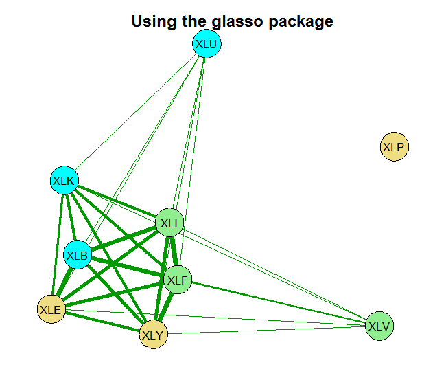
We can use the research (and code) by Jerome Friedman, Trevor Hastie, and Robert Tibshirani. Sparse inverse covariance estimation with the graphical lasso. Biostatistics, 9(3):432 – 441, 2008 (open access), who build on previous work by Meinshausen and Bühlmann (2006). The idea is to regress each variable on all the others using the LASSO. For those variables with coefficients equal to zero, the entries in the covariance matrix would be zero (meaning those variables are not connected).
We can ask the glasso package in R to do that for us. The Friedman et al. paper essentially presents a new algorithm, a fast one!
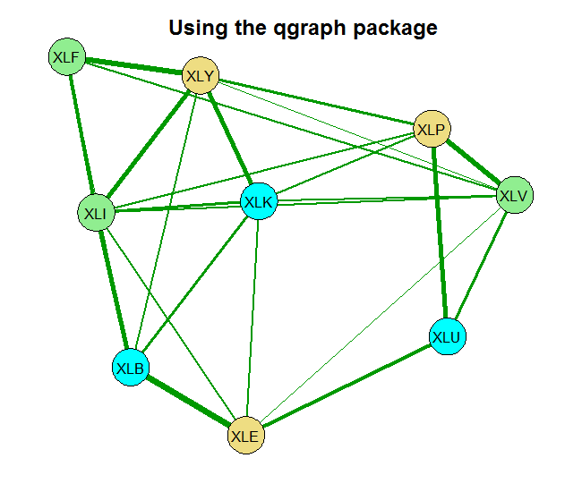
Before we go on to code, those of you who have some experience with the LASSO know that there is some refining to be done. Specifically with the shrinkage parameter. There is further work by Epskamp and colleagues (2012) who created another package called qgraph which builds on the glasso. What they do is to relieve the user from the trial and error surely to accompany the tuning of the shrinkage parameter. Their qgraph has all kinds of ways to set that hyper parameter. I here use the extended BIC criterion. That is also the package we rely on for plotting. From Meinshausen and Bühlmann (2006) to Friedman et al. (2008) to Epskamp et al. (2012) to your workstation (2016).
We start by pulling 10 years of ETF data representing different sectors in the economy, and convert it to weekly returns.
|
1 2 3 4 5 6 7 8 9 10 11 12 13 14 15 16 |
library(quantmod) k <- 10 # how many years back? end<- format(Sys.Date(),"%Y-%m-%d") start<-format(Sys.Date() - (k*365),"%Y-%m-%d") symetf = c('XLY','XLP','XLE','XLF','XLV','XLI','XLB','XLK','XLU') l <- length(symetf) w0 <- NULL for (i in 1:l){ dat0 = getSymbols(symetf[i], src="yahoo", from=start, to=end, auto.assign = F, warnings = FALSE,symbol.lookup = F) w1 <- weeklyReturn(dat0) w0 <- cbind(w0,w1) TT <- NROW(w0) } |
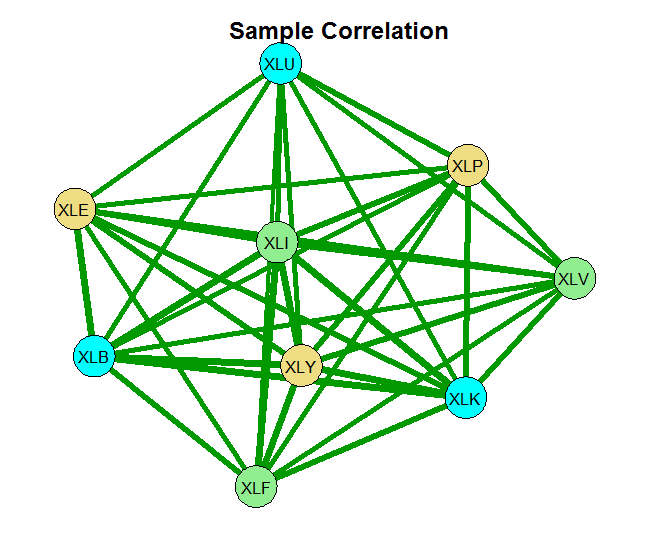
Now we estimate the correlation matrix of the returns. The basic estimate is the sample correlation. The second is based on the glasso using some ad hoc choice for the shrinkage parameter rho= 0.0005 and the last one sets the shrinkage parameter using the Extended BIC criterion.
We then plot the results.
|
1 2 3 4 5 6 7 8 9 10 |
# load the necessary libraries (install before if you don't have them) library(glasso) library(qgraph) # Create a correlation matrix using the LASSO spars1 <- glasso(cov(w0), rho= 0.0005) spars1 <- cov2cor(spars1$w) # cor(w0) - spars1 # you can have a look at the difference spars2 <- EBICglasso(S= cor(w0), n=TT, nlambda= 50, gamma= 0.5) |
You can see that without any shrinkage, the sample correlation matrix is quite thick, as it probably should be in this case. The second chart is something in-between, and the last chart shows that those 9 names, are really closer to 4 when it comes to portfolio diversification. There is that block on the bottom left which is tightly connected. Use this method for estimating and visualizing which banks/countries/tickers you need to worry about. Thinking about portfolios, you hope to see as thin lines as possible covering the net uniformly.
References
E. Candes and T. Tao. The dantzig selector: Statistical estimation when p is much larger than n. The Annals of Statistics (open access)
|
1 2 3 4 5 6 7 |
gr <- list(1:3,4:6,7:9) node_color<-c("lightgoldenrod","lightgreen","cyan") qgraph("Place here the estimate", fade = FALSE, layout="spring", groups=gr, color=node_color, labels=names(w0), label.scale=T, label.cex=1, node.width=.8, edge.width=.45, minimum=.001) |


Thanks or the interesting article.
a<-glasso(s, rho=.01)
How do I set the shrinkage parameter using the Extended BIC criterion?
Nice question. I had a close look. I think the function itself is a bit misleading. The reason is that the default value for
returnAllResultsis FALSE. This means the gamma parameter, which is supposed to represent the shrinkage parameter (see the paper: Extended Bayesian Information Criteria for Gaussian Graphical Models), simply does not make any difference. Whatever you input there, the function will compute and return the optimal correlation matrix. TypeView(EBICglasso)to examine the code for yourself and verify this is what actually happens.I would recommend setting
returnAllResults = Tand explore the different resulting correlation matrices there. This would give you the flexibility I reckon you are after.Hi! This is really interesting! Having a little trouble with the code though (I’m really new to R). The last bit of code, for qgraph, has this:
qgraph(“Place here the estimate”, …
What am I supposed to replace this value with?
Also, does this just create the qgraph version? How is the glasso graph created? The middle bit of code doesn’t seem to have any chart calls that I can see.
But again, I might just be missing something blindingly obvious. 🙂 Thanks!
In
qgraph(“Place here the estimate”, …, “Place here the estimate” means the estimate for the correlation matrix you would like to plot. For examplespars1 <- glasso(cov(w0), rho= 0.0005), sospars1would be your estimate. The code for the charts are in the bottom, together with the references.