This post has two goals. I hope to make you think about your graphics, and think about the future of data-visualization. An example is given using some simulated time series data. A very quick read.
In visualization, like in programming, presentation or any other skill, there is much to learn. Also like in other skills, there is no one best way of doing things. Rather, creating a good chart is task-specific, with many ways of achieving appealing, but also appalling results.
I recently finished reading An Economist’s Guide to Visualizing Data, which made me think about writing this. It is a paper from 2014 published in Journal of Economic Perspective, which talks about effective ways of presenting data. It outlines three principles: show the data, reduce the clutter and integrate the text and the graph. There are more of course, including those easy-to-follow 20 recommendations. Some more practical and more theoretical information in the references below.
Here is one thought process on the way to effective visualization. The last chart is more modern. I would already expect to see its kind in a 2014 paper, alas.
It uses javascript under the hood. Those kind of dynamic graphics are the future of visualization, period.
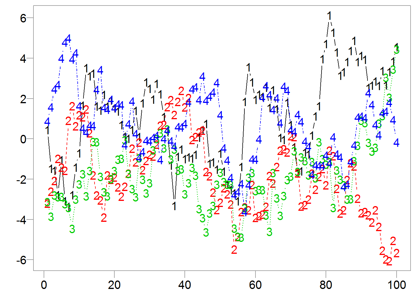
The following chart is for your eyes only. It is created using the very basic matplot function:
set.seed(12345)
TT <- 100
dat <- matrix(nrow = TT, ncol = 4)
for(i in 1:4){
 dat[,i] <- arima.sim(model= list(ar = c(0.9) ) , n= TT, rand.gen= rnorm)
}
matplot(dat, ylab= "", ty= "b")
Only for self consumption, you can’t really show it to anyone
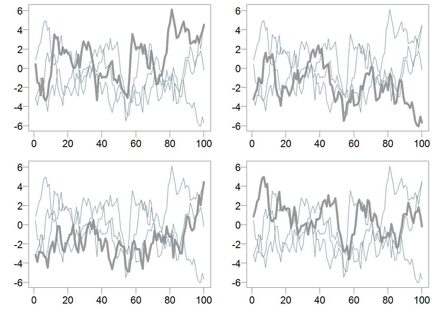
We can present each series in its own box:
for(i in 1:4){
 plot(dat[,i], ty= "l", ylab="")
}
Individual series

That’s not great, the y-axes above are not aligned, and it may be useful to compare the series which is hard to do still.
We can add the other series and color them differently:
for(i in 1:4){
 plot(dat[,i], ty= "l", ylab="", ylim= c(min(dat), max(dat)) )
 matlines(dat[,-i], col= trans_grey, ty= "l", lty= "solid")
}
Using different colors

This is better but still somewhat messy. Hard to distinguish between the series.
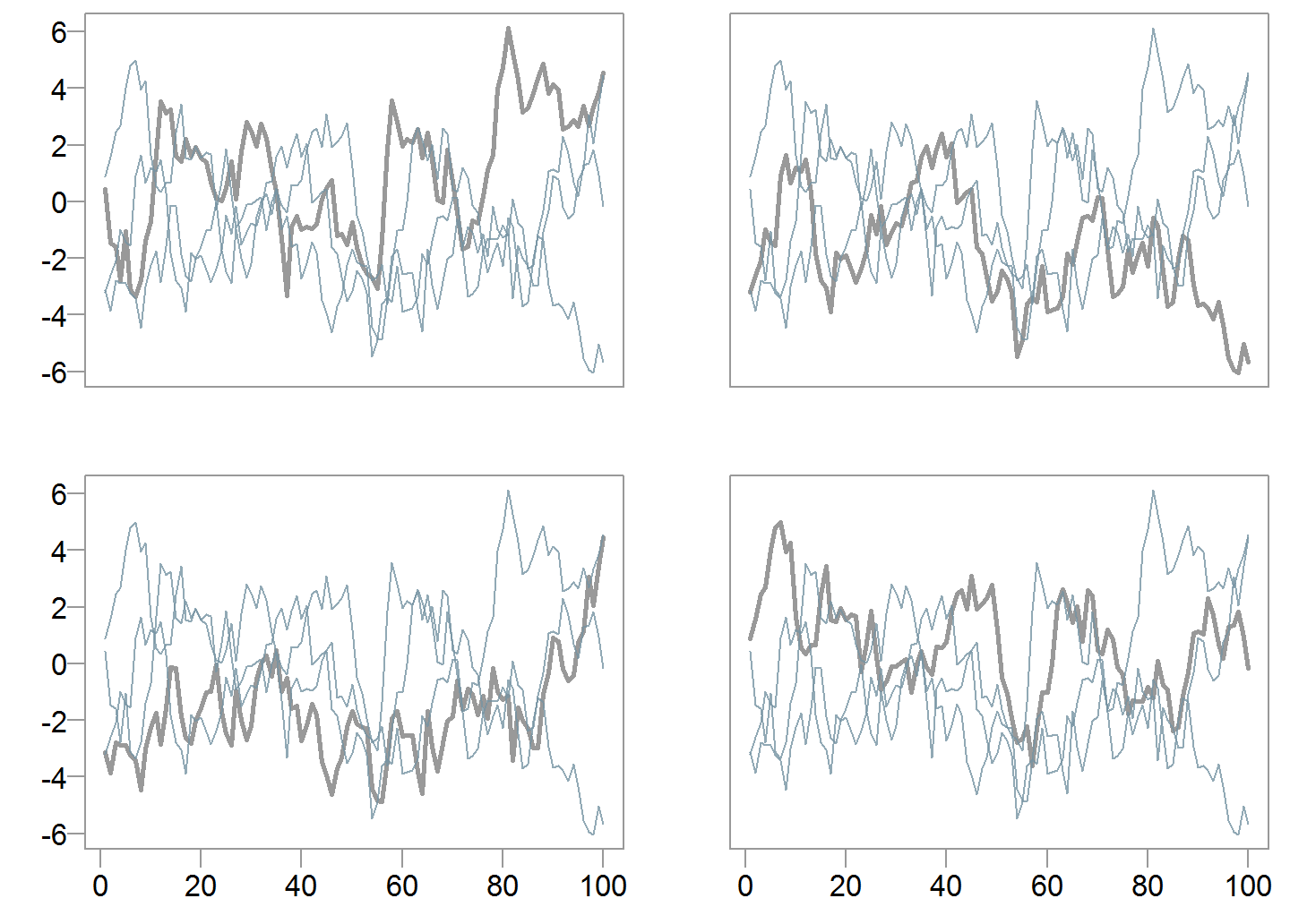
We can bold the relevant series:
for(i in 1:4){
 plot(dat[,i], ty= "l", lwd= 3,ylim= c(min(dat), max(dat)), ylab="")
 matlines(dat[,-i], col=trans_grey, ty= "l", lty= "solid")
}
Relevant series in bold
Owing to the third principle from the aforementioned 2014 paper, we can remove clutter. Charts can share the same axes:
for(i in 1:4){
 if(i<3) { xaxtt = "n" } else {xaxtt = "l"}
 if(i== 2 | i== 4) { yaxtt = "n" } else {yaxtt = "l"}
 plot(dat[,i], ty= "l", lwd= 2, xaxt= xaxtt, xlab= "", ylab= "", yaxt= yaxtt,  ylim= c(min(dat), max(dat)) )
  matlines(dat[,-i], col=trans_grey, ty= "l", lty= "solid")
}
Less cluttered
While this looks as something we can proudly present. We can do better with a dynamic chart.
The disadvantage of a dynamic chart is that it’s not for printing (you can snapshot, but it defeats the purpose). It is meant for digesting using something smarter than an A4. It is my experience that people still like to bring, and look at hard copies. However, this will change as the cost of excellent tablets inevitably drops, along with their weight.
The dygraphs package is needed here. Once installed (simply type install.packages("dygraphs")), R can now play with JS very nicely.
# Install if you don't have those libraries
library(dygraphs)
library(magrittr)
index <- c(1:NROW(dat))
dat <- as.data.frame(cbind(index, dat) )
dygraph(dat)  %>% dyRangeSelector()
Dynamic chart
Click on the “Hide Toolbars” button to see exactly the values of the series.
You can zoom in on specific observations. You can drag across a window using the range selector at the bottom. Double click to reset. What more you can ask for?
References
The Visual Display of Quantitative Information
Some interesting boxplot charts
The Elements of Graphing Data


One comment on “Visualizing Time series Data”