This post is about copulas and heavy tails. In a previous post we discussed the concept of correlation structure. The aim is to characterize the correlation across the distribution. Prior to the global financial crisis many investors were under the impression that they were diversified, and they were, for how things looked there and then. Alas, when things went south, correlation in the new southern regions turned out to be different\stronger than that in normal times. The hard-won diversification benefits evaporated exactly when you needed them the most. This adversity has to do with fat-tail in the joint distribution, leading to great conceptual and practical difficulties. Investors and bankers chose to swallow the blue pill, and believe they are in the nice Gaussian world, where the math is magical and elegant. Investors now take the red pill, where the math is ugly and problems abound.
Take a look at the following familiar figure:
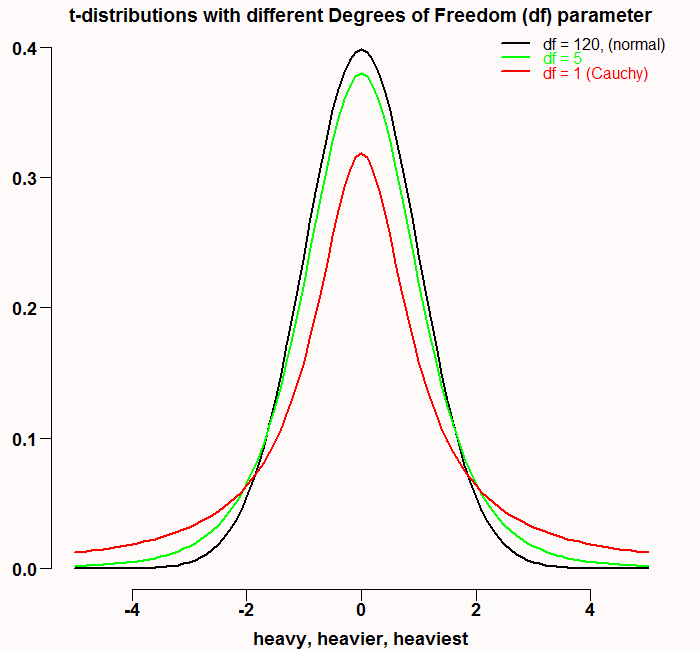
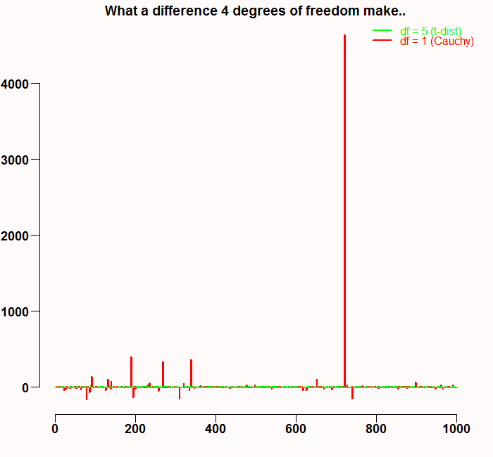
They say there is a thin man inside every fat man. Here the case is reversed. The black line is approximately normal, and has thin tails. The red line represents the Cauchy distribution which is a specific case of t-distribution with one degree of freedom*. Maybe because Cauchy hangs out with the t’s, it does not look like much at first glance, but don’t be deceived, it is nasty with a capital N. The tails of this distribution are in fact so fat, that the variance does not even exist. Sure, we can always compute empirical variance. But this is only because infinity is a theoretical concept, I never met her and neither did you. But basically, the tails are so fat they don’t decrease to zero fast enough, so with relatively high probability, we get a very high number which interferes with getting even very low moments like the mean or the variance. Have a look at the following figure. It is the result of a simulation of t-distribution with 1 degree of freedom (Cauchy distribution in red) and t-distribution with 5 degree of freedom (in green).
 I wonder how this would have been illustrated 30 years ago.
In order to compare different tail behavior we have what we call a tail index, see the nice post by Arthur Charpentier for more details about that. Briefly, in almost any distribution, observations after some threshold (say the observations in the worst 5% of the cases) are asymptotically Pareto distributed:
![\[F(x) = Pr(X > x) = \left\{ \begin{array}{rl} (\frac{x_m}{x} )^ \alpha & \; \mbox{ if $ x \geq x_m$}, \\ 1 & \qquad \mbox{if $x < x_m$,} \end{array} \right\]](https://eranraviv.com/wp-content/ql-cache/quicklatex.com-f400ed1cb035c306d1fe0c583e5d49fc_l3.svg "Rendered by QuickLaTeX.com")
where  is the cutoff and
  will determine the shape of the tail. is also called the tail index.
It is now common knowledge that financial returns exhibit fatty tails. This makes it even more important to keep the portfolio ready for a left tail events, because in that region you suffer from all assets simultaneously due to increased correlation (as recent financial crisis demonstrated). In this discussion, copulas play a vocal role. The concept of copula is quite neat. The word copula originates from Latin and it means to bind. When we have two (or more) asset class returns, we can assume or model their distribution. After we have done that we can “paste” them together and model only the correlation part, regardless of the way we initially modeled their individual distribution. HOW?
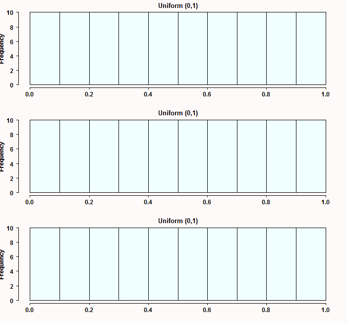
We start with the English statistician Ronald Fisher who in 1925 proved the amazingly useful property that the cumulative distribution function of any continuous random variable is uniformly distributed. Formally, for any random variable X, if we denote  as the cumulative distribution of X then
  . As a student I remember I was struggling to understand this mind-bender “distribution is distributed”. Remember that when we say it means nothing more than the probability.. the chance, that
  is smaller than some value
  . I mean this is the definition of cumulative probability isn’t it?
  . This is where the [0,1] comes from, because it is simply a probability. Don’t take my word for it though, see for yourself. Simulate from three different distributions: Exponential, Gamma and student-t, transform them and plot the histograms:
tempmat <- cbind(rexp(100), rgamma(100, shape = 6), rt(100, df=2))
tempmat <- apply(tempmat,2, function(x) {temp = ecdf(x)   ; temp(x) } ) # transform the matrix
# matplot(tempmat, ty="p", pch=19) # plot if you want
par(mfrow=c(3,1)) # split the screen
apply(tempmat, 2, hist, main="Uniform (0,1)", xlab="", col = "azure") # plot it
You can transform any continuous distribution in such a way. Now, denote two transformed random as  and
and  . We can "bind" (copula) them together:
  . Where
  is some function, and because the original variable is "invisible" (vanished when we transformed it to Uniform), we are now only talking about the correlation between the two variables. For example can be bivariate normal with some correlation parameter. I will not write here the bivariate normal density, but it is simply a density, and as such, it will say something about the probability to observe the two variables together in the center, and/or together in the tails. This is a way to go around the distribution of the original variables and talk about the correlation structure only.
Now let's model the correlation structure between two sectors, financial and Consumer Staples. Start with pulling the data:
library(copula) ; library(quantmod) ; library(MASS) # Load libraries
sym = c('XLP', 'XLF')
l=length(sym)
end<- format(Sys.Date(),"%Y-%m-%d")
start<-format(as.Date("2005-01-01"),"%Y-%m-%d")
dat0 = (getSymbols(sym[1], src= "yahoo", from=start, to=end, auto.assign = F))
n = NROW(dat0)
dat = array(dim = c(n,6,l))
prlev = matrix(nrow = n, ncol = l)
w0 <- NULL
for (i in 1:l){
	dat0 = getSymbols(sym[i], src="yahoo", from=start, to=end, auto.assign = F)
	 w1 <- dailyReturn(dat0)
	 w0 <- cbind(w0,w1)
}
time <- index(w0)
ret0 <- 100*as.matrix(w0) # more to percentage points
colnames(ret0) <- sym
mm <- apply(ret0, 2, mean) # define the mean
ss <- apply(ret0, 2, var) # and standard deviation

cor(ret0) # unconditional correlation:
XLP       XLF
XLP 1.0000000 0.6561685
XLF 0.6561685 1.0000000
What we do now is to transform the data as discussed (call it probability integral transformation) and plot it. Also, we simulate two random normals with the same (quantile-unconditional) correlation and compare the two figures.
transform_ret <- apply(ret0, 2, function(x) {temp = ecdf(x) ; temp(x) } )
# head(transform_ret)
TT <- NROW(ret0)
mdensity <- kde2d(transform_ret[,"XLP"], transform_ret[,"XLF"], n=round(TT/10) )
temp_col <- rgb(1,0,0, alph=1/14)
plot(transform_ret, ylab="",xlab= "")
grid()
contour(mdensity y, mdensity
![z, add=T, col= temp_col, fill=temp_col, drawlabels = F, lwd=65, ty="l") title("Actual data (transformed)") # Now simulate from two normals with the same correlation: library(mvtnorm) sim_norm <- rmvnorm(TT, mean = mm, sigma = cor(ret0)) transform_sim_norm <- apply(sim_norm, 2, function(x) {temp = ecdf(x) ; temp(x) } ) mdensity_sim <- kde2d(transform_sim_norm[,1], transform_sim_norm[,2], n=round(TT/10) ) plot(transform_sim_norm, ylab="",xlab= "") contour(mdensity_sim](https://eranraviv.com/wp-content/ql-cache/quicklatex.com-139674777d0ab04b4c440e39f78369fe_l3.svg "Rendered by QuickLaTeX.com") x, mdensity_sim
x, mdensity_sim z, add=T, col= temp_col, fill=temp_col, drawlabels = F, lwd=65, ty="l")
title("Simulated data (transformed)")
z, add=T, col= temp_col, fill=temp_col, drawlabels = F, lwd=65, ty="l")
title("Simulated data (transformed)")
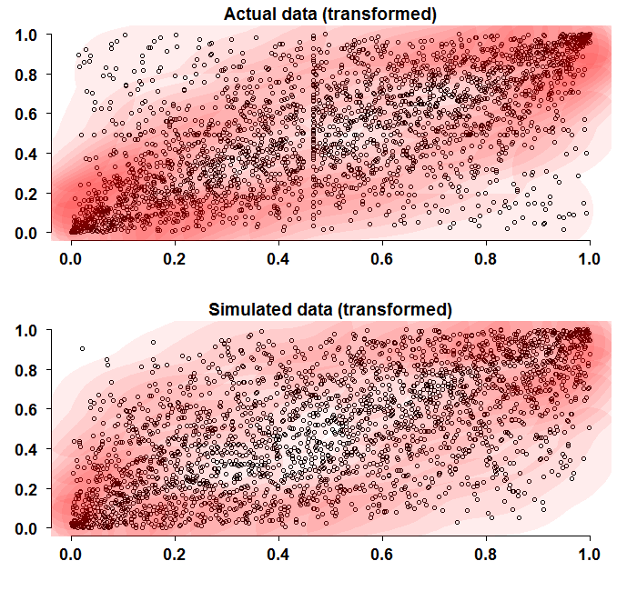
At first glance the two figures look similar. But a more detailed look reveals that the corners converge faster to the (0,0), (1,1) coordinates. This is also indicated by the darker contour colors in those regions. Remember that the simulated data use the same empirical correlation as the real data, so it is really just the structure that we are discussing here.
Let us now generate a copula function that we can use to "wrap" or to "bind" our transformed returns. We define one copula with heavy tails (df=1) and one with thinner tails (df=6). We can visualize how this function actually looks like. This is done in much the same way we visualize how normal density looks like, but now since it is a bivariate function, then it is a 3d plot:
shadee <- 0.3
copula_t_light <- tCopula(param = 0.6, dim = 2, dispstr = "un", df = 6, df.fixed = F)
copula_t_heavy <- tCopula(param = 0.6, dim = 2, dispstr = "un", df = 1, df.fixed = F)
persp(copula_t_light, dcopula, phi=15, theta=45, ticktype="detailed", ylab="",xlab="",zlab="",shade=shadee)
title("t-copula with light tail")
persp(copula_t_heavy, dcopula, phi=15, theta=25, ticktype="detailed", ylab="",xlab="",zlab="",shade=shadee)
title("t-copula with heavy tail")
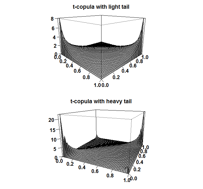
Next you can see that the usual correlation measures (discussed in post number (1)) are the same, apart from the tail index, again, since we only discuss the structure, not the magnitude.
> tau(copula_t_light)
[1] 0.4096655
> tau(copula_t_heavy)
[1] 0.4096655
> rho(copula_t_light)
[1] 0.5819201
> rho(copula_t_heavy)
[1] 0.5819201
> tailIndex(copula_t_light)
    upper     lower
0.2274528 0.2274528
> tailIndex(copula_t_heavy)
    upper     lower
0.5527864 0.5527864
It is not necessarily the case that the upper and lower tail are the same. This is simply a feature of the t-copula being symmetric function. In applications, a more realistic asymmetric copulas should be used.
Now we define the marginals, and estimate the copula parameters. For simplicity I define Normal marginals for the returns, but the copula is still t-dist with heavy tails:
# Define your marginals with parameters estimated from the data:
copula_t_heavy_marginals_normal <- mvdc(copula = copula_t_heavy, margins = c("norm", "norm"),
paramMargins = list(list(mean = mm[1], sd = ss[1]), list(mean= mm[2], sd= ss[2])))
# Fit the copula. The default for this function is to hide warnings so if an error occurs you have no idea. Which is unusually confusing.
# Add the "hideWarnings=FALSE" so that it tells if there is something wrong
copula_fit_norm <- fitMvdc(data=ret0, mvdc=copula_t_heavy_marginals_normal,
hideWarnings=FALSE, method = "SANN", start = list(cor(ret0)[1,2], ss[1], mm[1], ss[2], mm[2] ))
The function returns an S4 class with those available:
 slotNames(copula_fit_norm)
 slotNames(copula_fit_norm@mvdc)
 copula_fit_norm@mvdc@copula
 copula_fit_norm@estimate
 [email protected]
 [email protected]
 print( vcov(copula_fit_norm) )
 summary(copula_fit_norm)
 show(copula_fit_norm)
est <-  coefficients(copula_fit_norm) # our own estimates
my_fitted_cop <- mvdc(copula= norm_cop_ec, margins=c("norm","norm"),
paramMargins = list(list(mean = est[1], sd = est[2]), list(mean= est[3], sd= est[4]))  )
# Simulate from the fitted copula
sim_cop_fitted <- rMvdc(TT, my_fitted_cop)
plot(ret0, col = 1, pch=19, cex=1)
points(sim_cop_fitted, col = rgb(1,0,0,1/4), pch=19, cex=1)
abline( v=0, h=0, lty= "dashed", col = "blue", lwd=2)
title("Simulated from fitted copula in red")
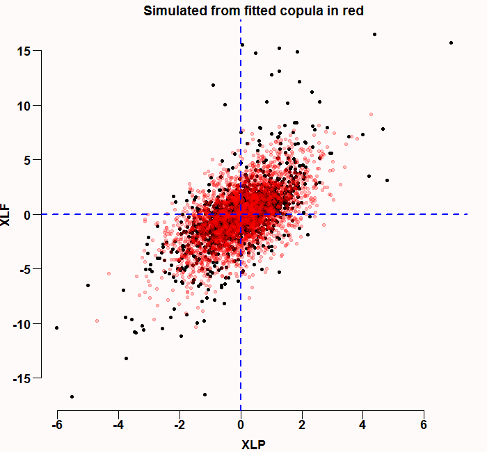
The correlation structure looks ok - but you can definitely see the normal marginals are not sufficient, there are few black points (real data) that are outside the red simulated cloud.
As a side note, nowadays we can also estimate copulas that do not have a pre-specified shape such as normal or t, but that are themselves estimates. This falls under the somewhat more complicated topic "non-parametric copulas".
* The cauchy also emerges as the ratio of two standard independent normals: here
References and further readings


