Tail risk conventionally refers to the risk of a large and sharp draw down of the portfolio. How large is subjective and depends on how you define what is a tail.
A lot of research is directed towards having a good estimate of the tail risk. Some fairly new research also now indicates that investors perceive tail risk to be a stand-alone risk to be compensated for, rather than bundled together with the usual variability of the portfolio. So this risk now gets even more attention.
Fast and painless, getting a dependable tail-risk estimate is the exact opposite. For one, the distribution of market returns is time varying (link to another post which shows that). Next is the fact that you can only use a small fraction of your data for estimation, by construction. And another question, how do you communicate that risk?
Some UBS research I have read aimed to create a visualization of tail risk. They presented a chart which I could only understand after asking a more experienced colleague. But that also moved me to spend some time on this, how can we visualize tail risk?
Basically we would like to see how heavy is the left tail, but heaviness is a relative term so we want to benchmark it against something. What we can do is to estimate the density of negative returns, and compare it with the density of positive returns. The next figure shows conditional densities, conditional on the sign of the returns (ticker SPY in this case). For ease of comparison the sign of the negative returns is reversed.
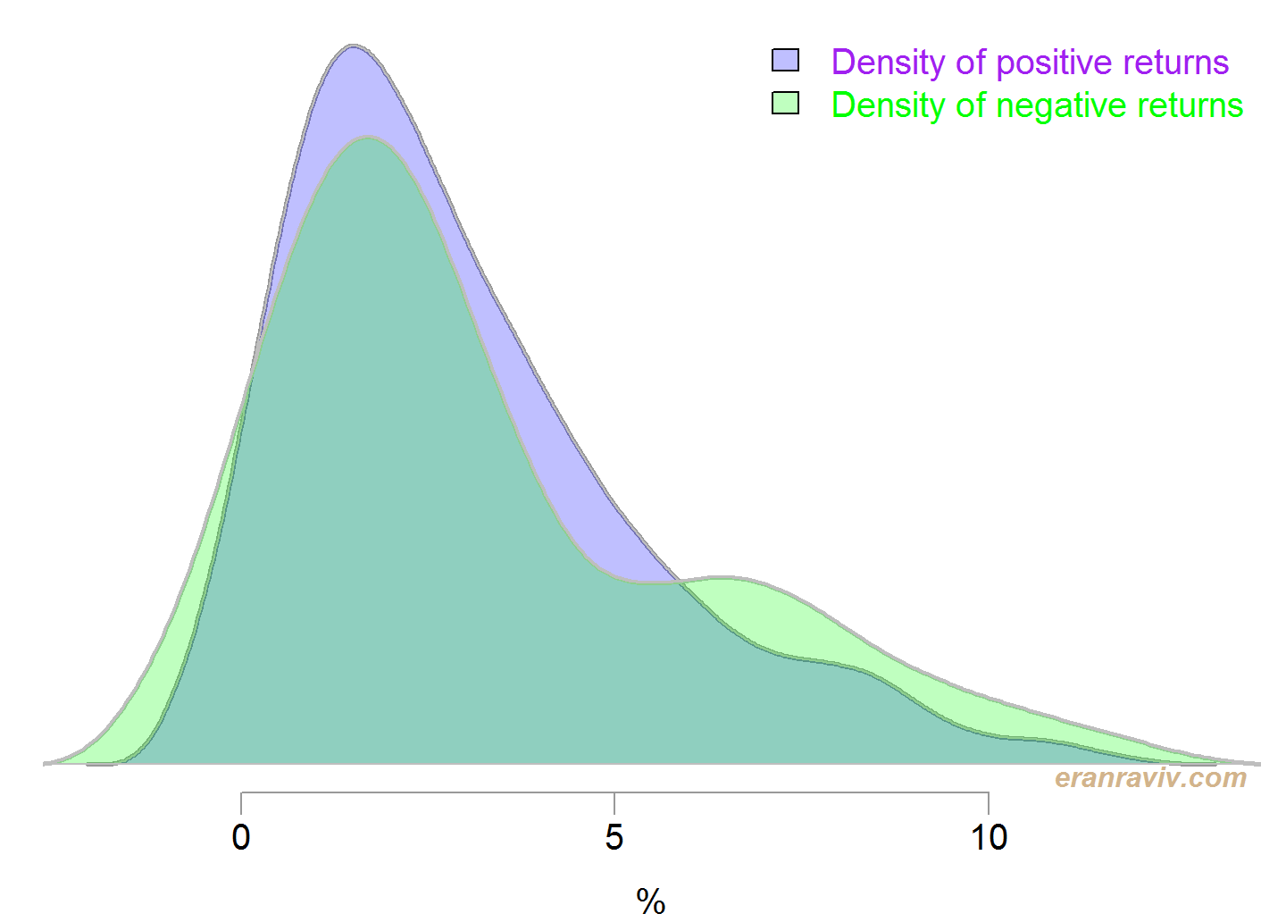
You can now get a feel for how fat is the left tail when compared with the right tail. Densities are estimated using the density function in R.
Another option is to order those positive and negative returns based on their absolute values, and plot the accumulation on the same scale so that they are comparable (check code for details). A steeper progression of the negative line that that of the positive line indicates that the added return is of larger magnitude than that of the (corresponding) positive return in that particular stage.
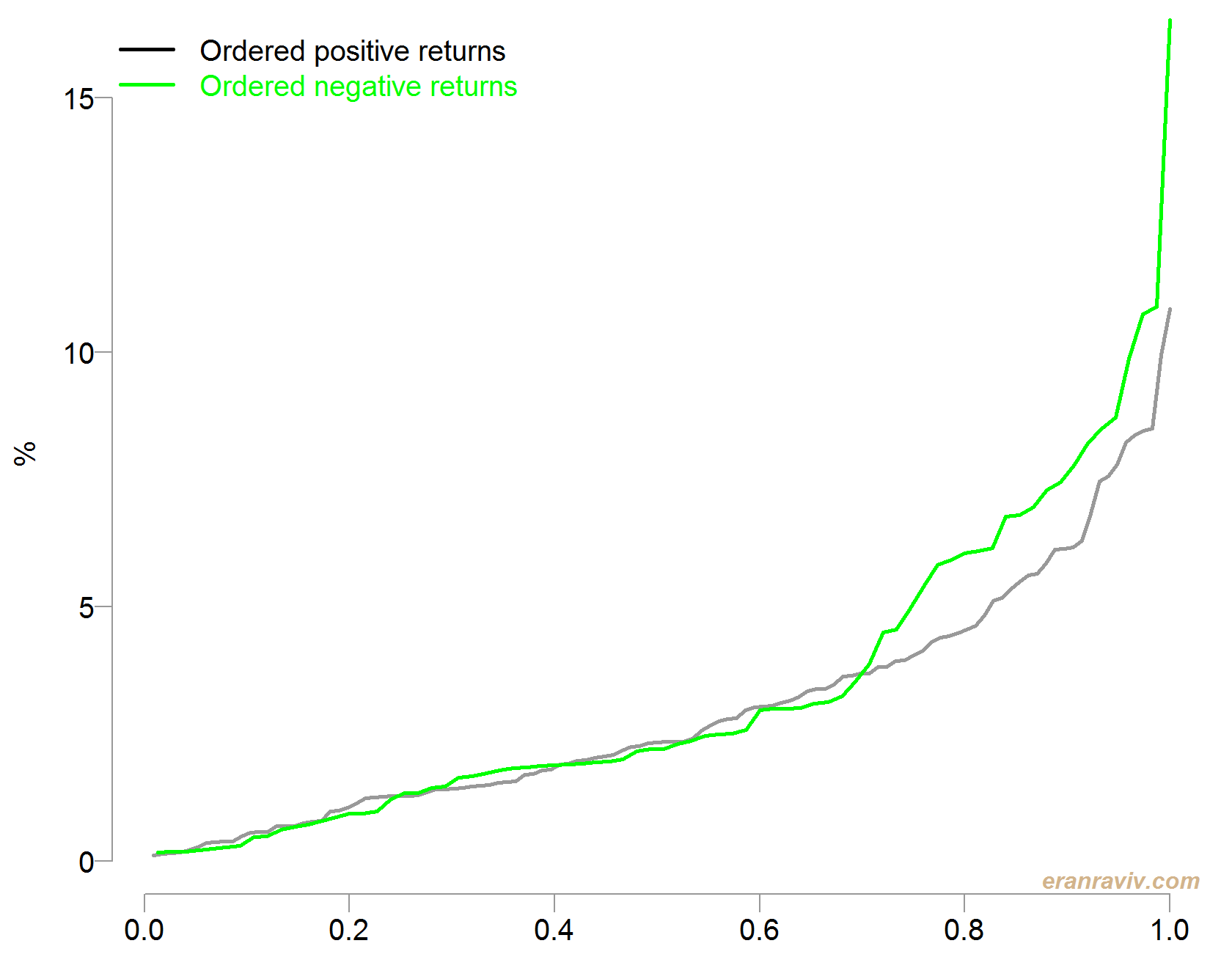
See how large is the gap when it comes to the extreme returns compared with the more frequent returns. Remember that the returns are ordered so we start by adding those returns which are small on the left x-axis, and add larger returns (in absolute terms) as we move right on the x-axis.
There is no inference here. No significance testing or alike. The goal is only to facilitate the communication of this all-important tail risk.
Code
library(quantmod)
sym = c('SPY')
end <- format(Sys.Date(),"%Y-%m-%d")
start <- format(as.Date("2000-01-01"),"%Y-%m-%d")
dat0 = getSymbols(sym, src="google", from=start, to=end, auto.assign = F)
ret <- as.numeric(100*monthlyReturn(dat0))
pos_ret <- ret[ret > 0]
neg_ret <- ret[ret < 0]
pos_d <- density(pos_ret, kernel ="cosine")
neg_d <- density(-neg_ret, kernel ="cosine")
plot(pos_d, yaxt= "n", main="", ylab="", xlab="%", lwd=2)
polygon(pos_d, col=transcol[1], border="gray")
lines(neg_d, col= "grey", lwd=2)
polygon(neg_d, col= transcol[2], border="gray")
legend("topright", c("Density of positive returns", "Density of negative returns"), fill=c(transcol[1], transcol[2]),
	bty = "n", text.col= c("purple", "green"))
tmp_ord <- order(abs(ret), decreasing= F)
tmpvec <- ret[tmp_ord]
npos <- length(tmpvec[tmpvec>0] )
nneg <- length(tmpvec[tmpvec<0] )
plot(tmpvec[tmpvec>0] ~ I((1:npos)/npos ), lwd=2, ty= "l", ylab="%", ylim= c(0,16))
lines(-tmpvec[tmpvec<0] ~ I((1:nneg)/nneg ), lwd=2,col= "green")
mlegend("topleft", c("Ordered positive returns", "Ordered negative returns"), col= c(1, "green") )
References
Bryan Kelly and Hao Jiang. Tail risk and asset prices. The Review of Financial Studies, 27(10):2841–2871, 2014
library(quantmod)
sym = c('SPY')
end <- format(Sys.Date(),"%Y-%m-%d")
start <- format(as.Date("2000-01-01"),"%Y-%m-%d")
dat0 = getSymbols(sym, src="google", from=start, to=end, auto.assign = F)
ret <- as.numeric(100*monthlyReturn(dat0))
pos_ret <- ret[ret > 0]
neg_ret <- ret[ret < 0]
pos_d <- density(pos_ret, kernel ="cosine")
neg_d <- density(-neg_ret, kernel ="cosine")
plot(pos_d, yaxt= "n", main="", ylab="", xlab="%", lwd=2)
polygon(pos_d, col=transcol[1], border="gray")
lines(neg_d, col= "grey", lwd=2)
polygon(neg_d, col= transcol[2], border="gray")
legend("topright", c("Density of positive returns", "Density of negative returns"), fill=c(transcol[1], transcol[2]),
bty = "n", text.col= c("purple", "green"))
tmp_ord <- order(abs(ret), decreasing= F)
tmpvec <- ret[tmp_ord]
npos <- length(tmpvec[tmpvec>0] )
nneg <- length(tmpvec[tmpvec<0] )
plot(tmpvec[tmpvec>0] ~ I((1:npos)/npos ), lwd=2, ty= "l", ylab="%", ylim= c(0,16))
lines(-tmpvec[tmpvec<0] ~ I((1:nneg)/nneg ), lwd=2,col= "green")
mlegend("topleft", c("Ordered positive returns", "Ordered negative returns"), col= c(1, "green") )


One comment on “Visualizing Tail Risk”