Contents
Context
Broadly speaking, we can classify financial markets conditions into two categories: Bull and Bear. The first is a “todo bien” market, tranquil and generally upward sloping. The second describes a market with a downturn trend, usually more volatile. It is thought that those bull\bear terms originate from the way those animals supposedly attack. Bull thrusts its horns up while a bear swipe its paws down. At any given moment, we can only guess the state in which we are in, there is no way of telling really; simply because those two states don’t have a uniformly exact definitions. So basically we never actually observe a membership of an observation. In this post we are going to use (finite) mixture models to try and assign daily equity returns to their bull\bear subgroups. It is essentially an unsupervised clustering exercise. We will create our own recession indicator to help us quantify if the equity market is contracting or not. We use minimal inputs, nothing but equity return data. Starting with a short description of Finite Mixture Models and moving on to give a hands-on practical example.
Mixture Models
Easy. Rather than each observation to come from a well-defined or familiar distribution such as gaussian, the observation now comes from a mixture of few distributions. Sometimes the term components is used to describe those distributions which we mix, so as to reserve the term distribution to describe the overall distribution, rather than the individual distributions. Omitting dependencies on individual parameters we can formally express a mixture of two distribution as:
![\[g(x_i) = \sum_{j=1}^2 \big( \lambda_j f_j(x_i) \big),\]](https://eranraviv.com/wp-content/ql-cache/quicklatex.com-3448a155c3109df86a00e35eff57208c_l3.svg "Rendered by QuickLaTeX.com")
Where  is the overall distribution,
  is for example a normal distribution with some mean and variance, and
  is again a normal distribution but with different mean and different variance.
  such that they sum up to one. So
  can be interpreted as the probability of an observation coming from each of the distributions. Theoretically speaking, if we have enough
  components it would mean that , no matter how complicated or flexible it is in reality, can be successfully approximated*. This is part of the reason for mixture models to be found in so many areas of application. Harvey Campbell and Liu Yan use it in their very nice paper: Rethinking Performance Evaluation to help them better understand the difference between money managers. E.g. which money manager is pulled from an with a positive alpha.
Mixture Models in R
You will be surprised to see how easy it is:
1. Pull some data on the SPY ETF and convert to daily returns.
library(quantmod)
sym <- c("SPY")
l <- length(sym)
end <- format(Sys.Date(), "%Y-%m-%d")
start <- format(as.Date("1990-01-01"), "%Y-%m-%d")
dat0 <- getSymbols(sym[1], src = "yahoo", from = start, to = end, auto.assign = F)
n <- NROW(dat0)
dat <- array(dim = c(n, 6, l))
prlev <- matrix(nrow = n, ncol = l)
w0 <- NULL
for (i in 1:l) {
dat0 <- getSymbols(sym[i], src = "yahoo", from = start, to = end, auto.assign = F)
w1 <- dailyReturn(dat0)
w0 <- cbind(w0, w1)
}
w0 <- w0*100
colnames(w0) <- sym
2. Use the open source R package mixtools to estimate  and ‘s. In the code below
 k is the number of components, lambda is an initial value of mixing proportions.
# install.packages("mixtools") # if not yet installed
library(mixtools)
citation("mixtools")
> mix_mod <- normalmixEM(w0[,"SPY"], k=2, lambda = c(0.2, 0.8))
# number of iterations= 132
> summary(mix_mod)
# summary of normalmixEM object:
#          comp 1    comp 2
# lambda 0.7554413  0.244559
# mu     0.0874119 -0.130347
# sigma  0.6621655  2.009636
# loglik at estimate:  -9378.518
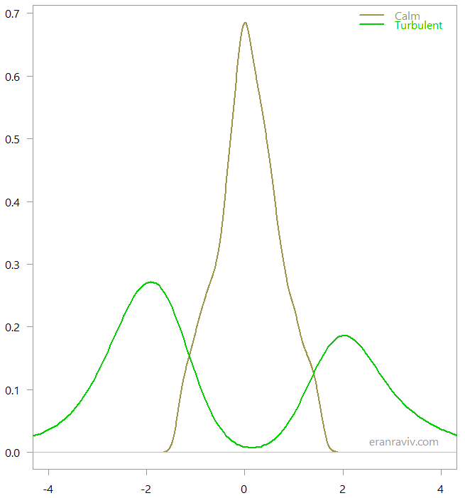
The way it was estimated is using the Expectation–maximization algorithm. Computer says that we have two distributions, one is more stable with lower volatility (~0.66) and a positive mean (~0.087), and another distribution with higher volatility (~2.0) and negative mean (~ -0.13). Also, the lambda eventually settles on 75% of the time we are in a stable environment, while 25% of the time observations belong with the more volatile regime. So with this limited information set we got something quite reasonable. Now per observation you have the posterior probability of that observation being from the first or second component. So to actually decide which observation belongs with which regime we can round that probability. If there is a higher probability for the observation to be from the more volatile regime, this is how it is classified, coding wise it means to round the probability:
regime <- apply(mix_mod$posterior, 2, round).
This is how the two regimes look when we look at the classified observations:
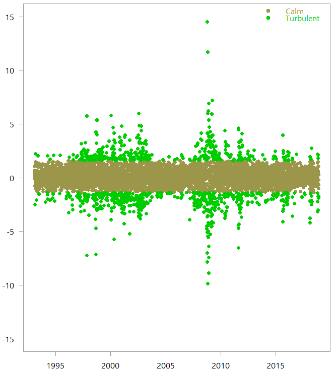
So based on the return data alone, the numerical algorithm created those two regimes, which are quite intuitive. Armed with this knowledge, we can now create our own recession indicator.
Create own Recession Indicator
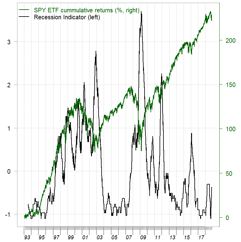
One way to create a recession indicator is to count the number of observations which are classified to the bear regime within some moving window. Volatility clustering stylized fact makes this idea make sense. We use a 120 days moving window, and standardize the result to have all history on the same footing.
library(magrittr)
# Choose the more volatile regime
recession_ind <- movave(regime[, 2], wind= 120, what= sum) %>% scale(scale= T)
# The movave is given at the end
We are almost there. It is better to have a probability of a recession on the left hand side. We can easily do that using a Sigmoid mapping:
recession_prob <- recession_ind %>% sigmoid
Resulting in:
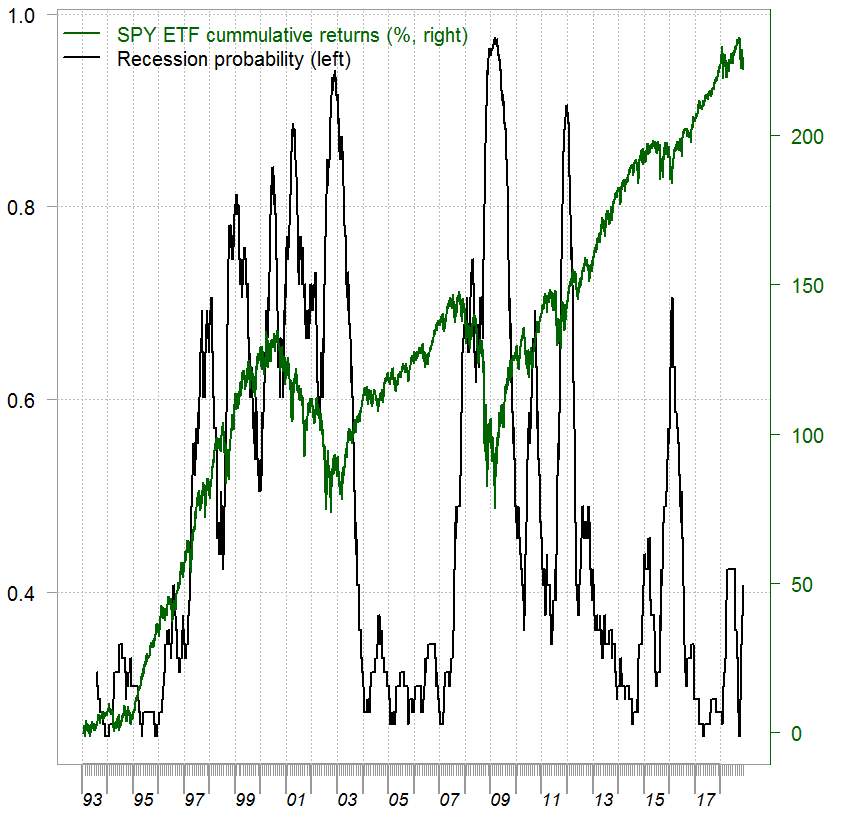
In my opinion the figure above reflects a much more realistic situation; how difficult it is for a money manager to evaluate the regime we are in. Compare our recession indicator with other, more traditional recession indicators. For example this one below from the Fed, which looks ridiculously smooth**:
References, code and some footnotes
Benaglia, Tatiana, et al. "mixtools: An R package for analyzing finite mixture models." Journal of Statistical Software 32.6 (2009): 1-29
* Although the paper On approximations via convolution-defined mixture models states that it is more or less a folk theorem.
** It should be smoother since it's about the economy rather than the equity market but still.
movave <- function(series, wind=12, what= mean){
TT <- length(series)
temp <- NULL
for (i in 1:(TT - wind+1)){
temp[(i+wind-1)] <- what(series[i:(i+wind-1)],na.rm=T)
}
temp
}


2 comments on “Create own Recession Indicator using Mixture Models”