Given a constant speed, time and distance are fully correlated. Provide me with the one, and I’ll give you the other. When two variables have nothing to do with each other, we say that they are not correlated.
You wish that would be the end of it. But it is not so. As it is, things are perilously more complicated. By far the most familiar correlation concept is the Pearson’s correlation. Pearson’s correlation coefficient checks for linear dependence. Because of it, we say it is a parametric measure. It can return an actual zero even when the two variables are fully dependent on each other (link to cool chart).
Less but still, we are familiar with some other correlation measures:
– Spearman’s rank (or Spearman’s rho)
– Kendall rank correlation (or Kendall’s tau coefficient)
Those dependence measures are to the Pearson’s correlation what the Median-statistic is to the Average-statistic. Look at the ordering, instead of at the values. Those are non-parametric measures since they don’t care about the shape of dependence at all. What do I mean by the shape of dependence? Well, say the shape of the correlation between two variables x and y is flat, then it does not matter in which region of the distribution of x we are in, what happens to x and y jointly is the same as what happens to them jointly when we are at a different region of x. Put differently, say x and y are tradeable assets, if the correlation between x and y is the same when they both have bad days as the correlation between them when they both have good days then we can broadly say, the shape of the correlation is constant. So you see, we are now discussion correlations while taking account of the whole distribution. I use dependence shape and correlation structure interchangeably, though I prefer the latter.
Before demonstrating this concept it is natural to ask why do we even care? Because we want the returns, but without the risk (we all do, don’t we?). Portfolios constructed based on correlation, can perform unexpectedly when the correlation structure is not well understood. Unexpectedly bad.
There is more than one way to illustrate what do we mean with correlation structure, and how is it different from correlation- period. Here we use Stocks and Bonds return correlation (check the references for a good review on stocks-bonds correlation, though the review is silent about correlation structure). We pull data on two ETF’s: SPY and TLT, which broadly track the stocks and bonds returns. Code below for those interested, but now have a look at the following figure:
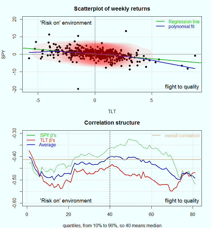
The chart in the upper panel
shows the weekly returns of the SPY over those of TLT. In green a regression line reflecting the average correlation between those two. Let’s merely say that on average, when bonds are up, stocks less so. When stocks are down, bonds returns are somewhat higher. Why is that? Too long to be answered here, and I refer to the reference and references therein. The blue line (polynomial fit) at least indicates that the correlation structure is not constant across the joint distribution of returns. The slope is sharper on the bottom right quadrant. When things become volatile, many investors turn to quality assets, understood as US-treasuries. This is typically dubbed as flight-to-quality. The top left quadrant is where stocks are preferred, a kind of risk-up behavior. All of this under the simplifying assumption that there is some competition between these two asset classes.
The chart in the bottom panel
was created using a framework introduced by Dirk G. Baur in the paper: The Structure and Degree of Dependence link. The idea is to estimate the degree of dependence (beta) using quantile regression across all quantiles. For example, the green line is the coefficients of the SPY’s ETF weekly returns when regressed on weekly TLT’s ETF returns. The red line is the coefficient (or sensitivity, or beta) of the TLT returns when regressed on the SPY returns. Bear in mind that unlike OLS (or mean-regression), quantile regression is used to estimate a coefficient conditional on specific quantile. That is what allows us to characterize the full correlation structure. In his paper, Baur does not touch upon the question which asset is on the right hand side of the regression and which on the left. Since the beta’s are obviously different, I average them. The blue line is the average of the red and the green lines, and the brown line is simply the empirical Pearson’s correlation coefficient, or what we can now describe as the (quantile-) unconditional linear correlation. Below as usual the code to replicate the analysis.
library(quantmod)
library(MASS)
library(quantreg)

sym = c('SPY', 'TLT')
l=length(sym)
end<- format(Sys.Date(),"%Y-%m-%d")
start<-format(as.Date("2005-01-01"),"%Y-%m-%d")
dat0 = (getSymbols(sym[1], src= "yahoo", from=start, to=end, auto.assign = F))
n = NROW(dat0)
dat = array(dim = c(n,6,l))
prlev = matrix(nrow = n, ncol = l)
w0 <- NULL
for (i in 1:l){
	dat0 = getSymbols(sym[i], src="yahoo", from=start, to=end, auto.assign = F)
	w1 <- weeklyReturn(dat0) # maybe daily returns are too noisy
	w0 <- cbind(w0,w1)
}
time <- index(w0)
ret0 <- as.matrix(w0)
colnames(ret0) <- sym
ret <- 100*ret0 # move to percentage points
TT <- NROW(ret)

# A needed function:
corquan <- function(seriesa,seriesb,k=10){
	if(length(seriesa)!=length(seriesb)){stop("length(seriesa)!=length(seriesb)")}
	seriesa <- scale(seriesa)
	seriesb <- scale(seriesb)
	TT <- length(seriesa)
	cofa <- cofb <- NULL
	for (i in k:(100-k)){
# The workhorse:
		lm0 <- summary(rq(seriesa~seriesb,tau=(i/100)))
		lm1 <- summary(rq(seriesb~seriesa,tau=(i/100)))
		cofa[i-k+1] <- lm0$coef[2,1]
		cofb[i-k+1] <- lm1$coef[2,1]
	}
	return(list(cofa=cofa,cofb=cofb))
}

temp2 <- corquan(ret[,"SPY"], ret[,"TLT"], k=10)
# First plot ####
####################
par(mfrow = c(2,1),bg='azure', mar = c(4, 4.1, 3, 1.7) )
plot(ret[,"SPY"]~ret[,"TLT"], ty="p", lwd=.8, col = 1, pch=19, ylab="SPY", xlab="TLT",
 main="Scatterplot of weekly returns", ylim=c(-20,20))
abline(lm(ret[,"SPY"]~ret[,"TLT"]), col = 3, lwd=2)
abline(v=0,h=0)
dens<- kde2d(ret[,"SPY"], ret[,"TLT"], n=round(TT/10) )
temp_col <- rgb(1,0,0, alph=1/14)
lines(lowess(ret[,"TLT"], ret[,"SPY"],f = 1/6), col=4, lwd=2)
grid()
contour(dens$x, dens$y, dens$z, add=T, col= temp_col, fill=4,  drawlabels = F, lwd=55, ty="l")
cornertext("bottomright", "flight to quality")  # code for this function in the post:
cornertext("topleft", " 'Risk on' environment") # https://eranraviv.com/adding-text-to-r-plot/
legend("topright", c("Regression line", "polynomial fit"), col = c(3,4), text.col = 3:4, bty="n", lwd=2, lty=1)

# Second plot ####
plot(temp2$cofa, ylim=c(-.6,-.3), ty="l", col=3, ylab="", main="Correlation structure",
					xlab= "quantiles, from 10% to 90%, so 40 means median")
lines(temp2$cofb, col = 2, lwd=2)
lines(apply(cbind(temp2$cofb, temp2$cofa), 1, mean),col=4, lwd=2)
aline(cor(ret)[1,2]) ; grid() ; abline(v=40, lty="dashed" )
cornertext("bottomright", "flight to quality")
cornertext("bottomleft", " 'Risk on' environment")
legend("topleft", c(expression(paste( " SPY ", beta, "'s")),
expression(paste( " TLT ", beta, "'s") ),"Average" ),
col=c(3,2,4), bty="n", lty= 1, lwd = lwd1, text.col= c(3,2,4))
legend("topright", c("overall correlation" ), col='tan', bty="n", lty= 1, lwd = lwd1, text.col= 'tan')
References:
Century of stock-Bond Correlations (Reserve bank of Australia)


Hello Eran –
Quick question… why are you scaling the variables?
Good question. I actually did not see this anywhere. It makes sense though. When you compute the correlation you divide the covariance by the std of the individual variables. I think also here, I would not like to get large coefficients simply because one of the series has wider distribution. I would like the coefficients to say something about correlation structure, scaling beforehand helps the interpretation. I think.
Thanks for the response and I really enjoy reading your blog!