Principal component analysis (PCA) is one of the earliest multivariate techniques. Yet not only it survived but it is arguably the most common way of reducing the dimension of multivariate data, with countless applications in almost all sciences.
Mathematically, PCA is performed via linear algebra functions called eigen decomposition or singular value decomposition. By now almost nobody cares how it is computed. Implementing PCA is as easy as pie nowadays- like many other numerical procedures really, from a drag-and-drop interfaces to prcomp in R or from sklearn.decomposition import PCA in Python. So implementing PCA is not the trouble, but some vigilance is nonetheless required to understand the output.
This post is about understanding the concept of variance explained. With the risk of sounding condescending, I suspect many new-generation statisticians/data-scientists simply echo what is often cited online: “the first principal component explains the bulk of the movement in the overall data” without any deep understanding. What does “explains the bulk of the movement in the overall data” mean exactly, actually?
In order to properly explain the concept of “variance explained” we need some data. We would use very small scale so that we can later visualize it with ease. Now pulling price from yahoo for the three following tickers: SPY (S&P), TLT (long term US bonds) and QQQ (NASDAQ). Let’s look at the covariance matrix of the daily return series:
library(quantmod)
library(magrittr)
library(xtable)
# citation("quantmod");  citation("magrittr") ; citation("xtable")
k <- 10 # how many years back?
end <- format(Sys.Date(),"%Y-%m-%d")
start <-format(Sys.Date() - (k*365),"%Y-%m-%d")
symetf = c('TLT', 'SPY', 'QQQ')
l <- length(symetf)
w0 <- NULL
for (i in 1:l){
	dat0 = getSymbols(symetf[i], src="yahoo", from=start, to=end,
        auto.assign = F,
	warnings = FALSE,symbol.lookup = F)
	w1 <- dailyReturn(dat0)
	w0 <- cbind(w0, w1)
}
dat <- as.matrix(w0)*100 # percentage
timee <- as.Date(rownames(dat))
colnames(dat) <- symetf
print(xtable( cov(dat), digits=2), type= "html")
| TLT | SPY | QQQ | |
|---|---|---|---|
| TLT | 0.77 | -0.40 | -0.39 |
| SPY | -0.40 | 0.90 | 0.96 |
| QQQ | -0.39 | 0.96 | 1.20 |
As expected SPY and QQQ have high covariance while TLT, being bonds, on average negatively co-move with the other two.
We now apply PCA once on a data which is highly positively correlated, and once on data which is not very positively correlated so we can later compare the results. We apply PCA on a matrix which excludes TLT: c("SPY", "QQQ") (call it PCA_high_correlation) and PCA on a matrix which only has the TLT and the SPY columns (call it PCA_low_correlation):
PCA_high_correlation <- dat[, c("SPY", "QQQ")] %>% prcomp(scale= T)
PCA_high_correlation %>% summary %>% xtable(digits=2) %>% print(type= "html")
PCA_low_correlation <- dat[, c("SPY", "TLT")] %>% prcomp(scale= T)
PCA_low_correlation %>% summary %>% xtable(digits=2) %>% print(type= "html")
PCA_high_correlation:
| PC1 | PC2 | |
|---|---|---|
| Standard deviation | 1.42 | 0.28 |
| Proportion of Variance | 0.96 | 0.04 |
| Cumulative Proportion | 0.96 | 1.00 |
PCA_low_correlation :
| PC1 | PC2 | |
|---|---|---|
| Standard deviation | 1.11 | 0.65 |
| Proportion of Variance | 0.74 | 0.26 |
| Cumulative Proportion | 0.74 | 1.00 |
I am guessing the detailed summary contributes to the lack of understanding amidst undergraduates. In essence only the first row should be given so any user would be forced to derive the rest if they need to.
The first step in order to understand the second row is to compute it. The first row gives the standard deviation of the principal components. Square that to get the variance. The Proportion of Variance is basically how much of the total variance is explained by each of the PCs with respect to the whole (the sum). In our case looking at the PCA_high_correlation table:  . Notice we now made the link between the variability of the principal components to how much variance is explained in the bulk of the data. Why is this link there?
The average is a linear combination of the original variables, where each variable gets  . The PC is also a linear combination but instead of each of the original variables getting the weight, it gets some other weight coming from the PCA numerical procedure. We call those weights “loadings”, or “rotation”. Using those loadings we can “back out” the original variables. It is not a one-to-one mapping (so not the exact numbers of the original variables), but using all PCs we should get back numbers which are fully correlation (correlation=1) with the original variables*. But what would be the correlation if we try to “back out” using not all the PCs but only a subset? This is exactly where the variability of the PCs comes into play. If it is not entirely clear at this point, bear with me to the end. It would become clearer as you see the numbers.
Coming back to our 2-variables PCA example. Take it to the extreme and imagine that the variance of the second PCs is zero. This means that when we want to “back out” the original variables, only the first PC matters. Here is a plot to illustrate the movement of the two PCs in each of the PCA that we did.
The first two PCs from the PCA_high_correlation
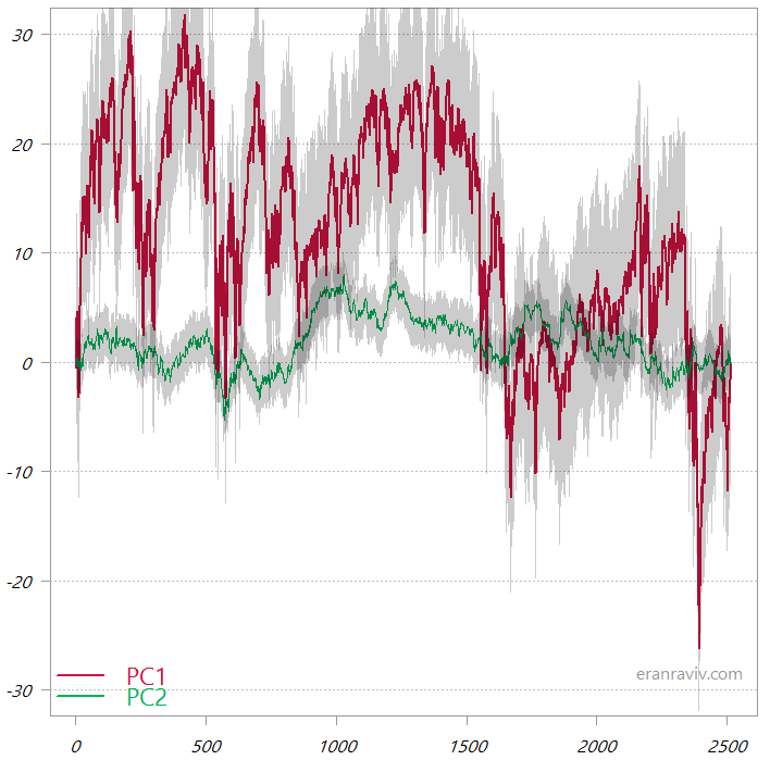
These are the cumulative sums of the two principal components. The shaded area is one standard deviation.
You can see that the first principal component is much more variable, so when we “backtrack” to the original variable space it would be this first PC that almost completely would tell us the overall movement in the original data space. By way of contrast, have a look at the two PCs from the PCA_low_correlation:
The first two PCs from the PCA_low_correlation
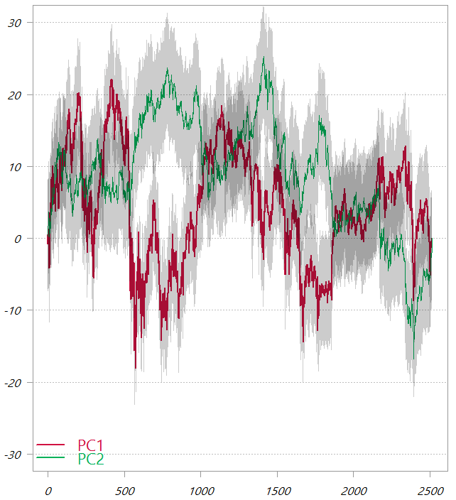
These are the cumulative sums of the two principal components. The shaded area is one standard deviation.
In this chart, as also seen from the third table in this post, the variability of the two PCs is much more comparable. It means that now in order to “backtrack” to the original variable space the first factor would give a lot of information, but we would also need to second factor to genuinely map back to the original variable space.
You know what? Let’s not be lazy and do it. Let’s back out the original variables from the PCs and visualize how much can we tell by using just the first component and how much can we tell by using both components. The way to back out the original variables (again, not a one-to-one mapping..) is using the rotation matrix:
# First chart
back_x_using1 = PCA_high_correlation$x[,1] %*% t(PCA_high_correlation$rotation[,1])
back_x_using2 = PCA_high_correlation$x[,1:2] %*% t(PCA_high_correlation$rotation[,1:2])
plot(back_x_using1[,1], dat[,"SPY"], ylab="", main= "SPY backed out from the first PC")
plot(back_x_using1[,2], dat[,"QQQ"], ylab="", main= "QQQ backed out from the first PC")
plot(back_x_using2[,1], dat[,"SPY"], ylab="", main= "SPY backed out from both PCs")
plot(back_x_using2[,2], dat[,"QQQ"], ylab="", main= "QQQ backed out from both PCs")
# Second chart
back_x_using1 = PCA_low_correlation$x[,1] %*% t(PCA_low_correlation$rotation[,1])
back_x_using2 = PCA_low_correlation$x[,1:2] %*% t(PCA_low_correlation$rotation[,1:2])
plot(back_x_using1[,1], dat[,"SPY"], ylab="", main= "SPY backed out from the first PC")
plot(back_x_using1[,2], dat[,"TLT"], ylab="", main= "TLT backed out from the first PC")
plot(back_x_using2[,1], dat[,"SPY"], ylab="", main= "SPY backed out from both PCs")
plot(back_x_using2[,2], dat[,"TLT"], ylab="", main= "TLT backed out from both PCs")
“Backed out” values over actual values for PCA_high_correlation
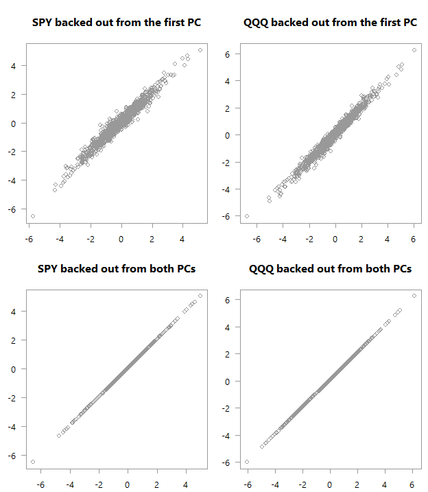
Top: scatter plot of the original variables as backed out from the first PC over their actual values. Bottom: Of course, if you are using all PCs you will get back the original space.
“Backed out” values over actual values for PCA_low_correlation
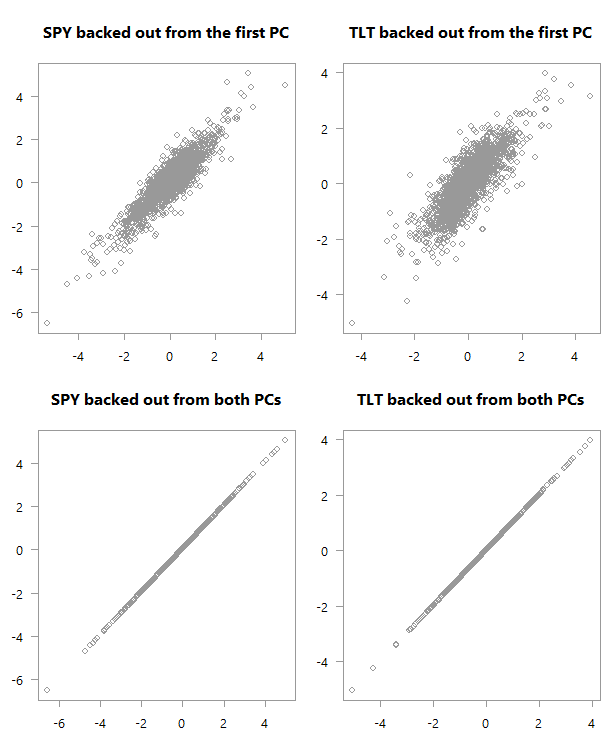
Top: scatter plot of the original variables as backed out from the first PC over their actual values. Bottom: Of course, if you are using all PCs you will get back the original space.
Consider the four panels in each of the above charts. See how in the first chart there is much stronger correlation between what we got using just the first PC and the actual values in the data. We almost don’t need the second factor in order to get an exact match in terms of the movement in the original space (here I hope you are glad you continued reading). Quite amazing if you think about it. You can see why this PCA business is so valuable; we have reduced the two variables to one without losing almost any information. Now think about the yield curve. Those monthly\yearly rates are highly correlated, which means we don’t need to work with so many series, but with one series (first PC) without losing much information.
Back to our charts. At the bottom chart we get a good feel for the data from the first PC. But it is not as strong as what we get in the first case (upper chart). The reason is that the low correlation makes for a more difficult summarization of the data if you will. We need more principal components to help us grasp the (co)movement in the original variable space.
Footnotes
* This is because PCA is often centered PCA (we center the original variables, or center and scale them- which is like working with a correlation matrix instead of the covariance matrix)
Some related previous posts and references
Practical Guide To Principal Component Methods in R
Multivariate Statistical Analysis: A Conceptual Introduction


Principal component analysis: a review and recent developments


One comment on “Understanding Variance Explained in PCA”